How To Build A Designer Sticker Pack That People Actually Want
Last updated: April 6, 2026
A good designer sticker pack is not just a handful of stickers in a bag. People can feel the difference immediately. One pack feels like a real release. The other feels like somebody cleaned out a drawer. If you want people to remember your pack, trade for it, buy it, or come back for the next one, the pack needs a point of view.
That does not mean it needs to be fancy. It just needs to feel intentional. The best designer sticker packs usually have a clear theme, a smart mix of shapes and sizes, a couple of strong anchor designs, and packaging that makes the whole thing feel like one product instead of several loose parts trying to cooperate.
There is a practical side to this too. Public descriptions tied to the DesignerStickers.net orbit and related Underground Blend projects show that curated packs have long been part of designer sticker culture. And current pack guides from major sticker printers make the same thing obvious in a different way: sticker packs work best when they are treated as retail-ready collections, not random assortments. That is the frame to keep in mind while you build.
Start With One Clear Idea
Every strong designer sticker pack begins with one sentence.
Not a paragraph. Not a mood board dissertation. One sentence.
Maybe it is:
“A pack of ugly cute sewer creatures.”
“A set of handstyle-based warning labels.”
“A three-color series of occult snack mascots.”
“A clean black-and-white protest pack.”
“A toy-inspired character lineup.”
Whatever it is, make it specific enough that you can tell what belongs and what does not. That is where editing begins.
The mistake people make is trying to cover too much ground in one release. They mix old logos, new characters, one text piece, a random holiday design, and a leftover collab, then wonder why the pack has no shape. It has no shape because it was never one thing.
If you start with one clear concept, everything else gets easier:
the color palette,
the size decisions,
the hero piece,
the header card,
the tone of the copy,
even the material choices.
This does not mean every sticker needs to look identical. Actually, that can make a pack boring. You want variation inside a shared world. Same band, different songs.
Decide What Kind Of Pack You Are Making
Not every designer sticker pack should solve the same problem. Figure out the job first.
A pack can be:
A Collector Pack
This is for people who want the full set. It leans harder on theme, continuity, and presentation.
A Trade Pack
This is for swapping with other artists. It may be lighter, faster to reproduce, and built around strong singles that can still stand alone if separated.
A Retail Pack
This needs to work hanging on a display or sitting in a shop. Packaging matters more. So does instant readability.
An Intro Pack
This is for new people discovering your work. It should include your clearest, most recognizable pieces, not your deepest cuts.
A lot of packs fail because they are trying to do all four jobs at once. Pick a lane. You can always build another pack later.
How Many Stickers Should Be In A Designer Sticker Pack?
There is no sacred number, but there is a practical range.
Retail guides from current sticker pack printers often describe packs as collections of multiple die cut stickers, and some common pack formats land in the 2 to 7 design range. That fits real life pretty well. Once you go past that, one of two things usually happens. Either the individual stickers get too small, or the pack starts feeling bloated and unfocused.
For most artist-led releases, i think the sweet spot is around 4 to 7 pieces.
That gives you room for:
- one hero design
- two or three core support pieces
- one wildcard or text hit
- one simple logo or icon if it actually belongs
That is enough variety to feel like a set without turning the pack into a junk drawer. If you only have two truly strong designs, be honest and make a smaller, bolder pack. Nobody ever complained that a release had too much clarity.
Build Around One Hero Sticker
Almost every memorable designer sticker pack has one sticker that carries the release.
It might be the biggest piece.
It might have the strongest silhouette.
It might be the most detailed character.
It might be the phrase everyone quotes back to you.
Whatever it is, identify it early.
Your hero sticker does a few important jobs. It sets the tone, gives the pack a face, and helps buyers or traders remember the release later. It is the piece that ends up on the front of the header card, in the promo shot, or at the top of the stack in a mail post.
Once you know the hero, the rest of the pack becomes easier to organize. Supporting designs can echo it, contrast with it, or simplify it. But they should not fight it.
One strong pack formula looks like this:
- Hero piece with the fullest idea
- Two medium pieces that expand the theme
- One clean small icon or symbol
- One text or tag-driven piece
- One oddball extra if it still fits the concept
That mix gives the eye some rhythm. Big. Medium. Small. Dense. Simple.
Vary The Shapes, Not Just The Artwork
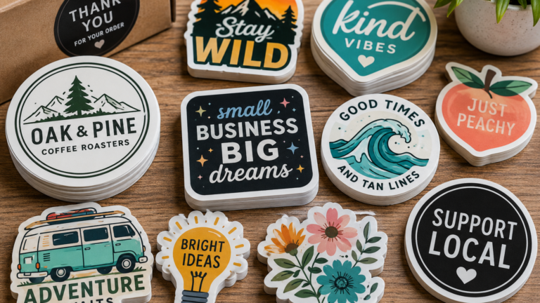
A designer sticker pack can have great artwork and still feel flat if every sticker is the same shape and scale. You need physical variety, not just visual variety.
Think in terms of silhouette.
A rounded head sticker next to a tall vertical tag reads differently than a circular seal or a jagged die cut phrase. That is good. It makes the pack feel alive. It also gives people more placement options. Some stickers work better on laptops, some on bottles, some in books, some on postal mail, some on poles if that is part of your world.
Do not force novelty, though. If every shape is trying to scream, the pack gets noisy. Usually one or two strong irregular shapes plus a couple cleaner support shapes is enough.
A good question to ask is: if I removed the artwork and only looked at the cut outlines, would this still feel like an interesting set?
If the answer is no, keep working.
Keep The Art Legible At Sticker Size
This one sounds basic, but a lot of people ignore it. A sticker pack is not a print portfolio shrunk down. It is a sticker pack. The pieces need to read at actual sticker size.
Design guides from sticker and marketplace platforms keep repeating the same advice for a reason: high resolution matters, fine details can disappear, and good sticker design usually needs a clear focal point with enough negative space to breathe. That is not boring advice. That is what keeps a pack from turning into visual soup.
A few practical rules help:
Text should be readable without a magnifying glass.
Tiny line detail should either be bold enough to survive or removed.
Background clutter should earn its keep.
Characters should have a clean outer read.
Negative space is your friend.
You are not “dumbing down” the art by simplifying for print. You are respecting the format.
Choose Materials On Purpose
Your designer sticker pack should not treat material like an afterthought. Material changes the mood.
Standard vinyl is the default for a reason. It is durable, flexible, and easy to live with. Current vinyl sticker guides regularly describe it as waterproof, weather resistant, scratch resistant with laminate, and solid for both indoor and outdoor use.
But default does not always mean best.
A few examples:
Matte vinyl can help moody illustration, black-and-white graphics, muted palettes, or packs that want a softer less shiny feel.
Gloss can make bright colors, pop cartoons, and graphic logo work hit harder.
Holographic stock is great when the reflective effect supports the design. It is less great when your art depends on pale details or subtle white elements. Some sticker design guides specifically warn that lighter colors may get lost on holographic film if you do not plan around that.
Clear stock can be excellent if transparency is part of the idea. But clear stickers require more thought because white ink handling and background interaction affect how the final art reads.
You do not need every special material in one pack. In fact, mixing too many finishes can make the release feel scattered. A designer sticker pack usually looks better when the material choices feel deliberate, not like a sampler platter.
Packaging Matters More Than People Admit
Sticker pack guides from current printers describe retail-ready packs as sealed collections that can include header cards, branding, and hang options. Even if you are not aiming for store shelves, that logic still applies. Packaging is part of the experience.
A pack without packaging can still work in some trade settings, but once you want a release to feel complete, presentation matters.
The header card does a lot of hidden labor:
- names the release
- gives the pack a face
- helps it read instantly in photos
- protects the top edge
- makes the set feel finished
Your header card does not need a novel on it. Usually the pack name, artist name, maybe a simple mark or edition note, and a clean visual are enough.
The bag itself should keep the stickers flat, clean, and visible. Do not let packaging overpower the work. This is not luxury perfume. It is a sticker pack. Still, you want it to feel cared for.
Price It Like You Actually Want To Sell It
This is the part artists either overthink or completely ignore.
A designer sticker pack price should cover your print cost, packaging, fees, shipping materials if relevant, and your actual creative labor. But it also needs to make sense for the scene you are selling into. Sticker culture usually rewards accessible pricing more than inflated “art object” logic, unless the release is truly rare, handmade, or unusually complex.
A few practical questions help:
How many pieces are in the pack?
Are the materials standard or premium?
Is the packaging simple or retail-ready?
Is this meant for easy pickup, conventions, trades, or online orders?
Does the price feel fair for a first-time buyer discovering you?
You do not need the absolute cheapest pack in the room. You do need a price that matches the object honestly.
My opinion here is pretty simple. If people look at the pack and immediately start mentally breaking it apart to justify the cost, your pricing or your pack design may need work.
Test The Pack Before You Commit
Before you print a big batch, do a small reality check.
Lay the designs out together.
Print paper mocks if needed.
Stack them in order.
See how the header card covers the top.
See whether one piece feels off.
See whether two stickers are accidentally competing for the same role.
This step saves a lot of regret.
Some current pack ordering guides also point out that pack production starts with decisions about sticker size, shape, material, quantity, and header card. That is boring on paper but useful in practice. If you test those decisions before full production, your pack usually comes out tighter.
You can also show a mock to a few people whose taste you trust. Not a committee. Just two or three people who will tell you the truth. If they all point to the same weak piece, listen.
Release The Pack Like A Release
Once the pack is good, treat it like it matters.
Give it a name.
Photograph it cleanly.
Show the whole set and a few close details.
Explain the angle if that helps.
Mention whether it is limited, open run, trade-focused, or event-only.
A designer sticker pack feels stronger when it arrives like a complete thought. The release language, images, and packaging should all support the same idea. You are not just selling five stickers. You are presenting one set.
That is what people remember.
Conclusion
To build a designer sticker pack that people actually want, start with a clear concept and then edit hard. Pick a job for the pack. Keep the number of pieces manageable. Build around a hero sticker. Vary the shapes. Make the art legible at real sticker size. Choose materials that serve the work. Package it like a finished object. And price it in a way that feels honest.
That may sound like a lot, but really it comes down to one thing: intention.
The packs that land are the ones where every choice feels connected. Nothing is there by accident. Nothing feels left over. And when someone opens the bag, they can tell there was an actual brain behind it.