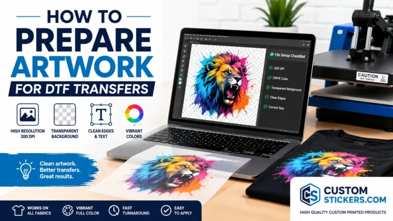
TLDR
- Use high-resolution artwork at the final print size.
- A transparent PNG is usually the safest file type for full-color DTF transfers.
- Vector files are best for logos, text, and clean shape-based artwork.
- Avoid screenshots, tiny text, rough edges, low-resolution exports, and unwanted backgrounds.
- Check shirt color, contrast, sizing, and placement before you order.
A great DTF transfer starts before the heat press ever turns on. The artwork file does a lot of the heavy lifting. If the image is blurry, too small, or sitting on top of a white box you did not want, the transfer will usually show it.
That is why learning how to prepare artwork for DTF transfers matters. Direct-to-film printing can handle full color, gradients, small details, and dark garments, but it still needs a clean file. Good artwork gives the printer a better starting point and gives you a better chance of getting a shirt, hoodie, tote, or merch piece that looks like you imagined.
For small businesses, creators, teams, and events, DTF is appealing because it keeps custom apparel flexible. You can order ready-to-press transfers from a supplier like CustomStickers.com without buying a full DTF printer setup. But even then, the file you upload still matters.
What DTF Transfers Need From Your Artwork
DTF transfers are printed onto film, backed with white ink when needed, coated with adhesive powder, cured, and then pressed onto fabric. That process works best when the artwork is clean, sharp, and built at the correct size.
The most important things to check are:
- final print size
- image resolution
- transparent background
- clean edges
- readable text
- color contrast
- file type
- unwanted pixels or artifacts
Think of the DTF transfer as a copy of your file. The process can reproduce a good design well, but it will not magically fix a bad upload. A fuzzy logo on screen may become a fuzzy logo on a shirt. A hidden white rectangle in the file may become a visible white rectangle on the garment.
Not the most exciting part of apparel production, but it saves a lot of headaches.
Start With The Final Print Size
Before exporting anything, decide how large the design should be on the garment. A left-chest logo, sleeve print, youth shirt graphic, and full-back print all need different sizing.
A common mistake is designing something small and then scaling it up later. For example, a 3-inch-wide logo may look fine on your laptop. But if you stretch that same file to 10 inches wide, it can become pixelated. The image did not gain new detail. It just got bigger.
Build the artwork at the size you actually want printed.
For example:
- left chest logo: often around 3 to 4 inches wide
- standard front shirt graphic: often around 9 to 11 inches wide
- full back print: often around 10 to 12 inches wide
- sleeve design: often around 2 to 4 inches wide, depending on layout
These are not strict rules. Shirt size, design shape, and style all matter. A tall narrow design may need different sizing than a wide mascot logo. The point is simple: decide the print size first, then prepare the artwork for that size.
Use 300 DPI For Raster Artwork
For raster files like PNG, JPG, TIFF, or PSD, resolution matters. A safe target is 300 DPI at the final print size.
DPI means dots per inch. In plain English, it tells you how much image information is available for each printed inch. More useful detail usually means cleaner edges and sharper print results.
Here is the practical version:
If your DTF transfer will be 10 inches wide, your file should ideally be about 3000 pixels wide.
That comes from:
10 inches x 300 pixels per inch = 3000 pixels
If the same design is only 800 pixels wide, it may look fine as a small social media image but print poorly as a full shirt graphic.
Do not rely on changing the DPI number alone. Some design programs let you type “300 DPI” into the export settings without actually increasing the real pixel dimensions. The file needs enough pixels at the final physical size.
Choose The Right File Type For DTF Transfers
A transparent PNG is usually the easiest file type for full-color DTF transfer artwork. It preserves clean artwork while removing the background area you do not want printed.
Vector files are even better for certain designs. If your artwork is a logo, icon, badge, text lockup, or simple graphic, vector formats like AI, EPS, SVG, or PDF can keep lines and text sharp at almost any size.
A good rule:
Use vector files when the design is built from shapes, logos, or text. Use a high-resolution transparent PNG when the design is a full-color illustration, photo-style graphic, or flattened artwork.
JPG files can work in some cases, but they are not ideal when you need transparency. A JPG always has a background. That background may be white, black, or another color, and it may print unless it is removed first.
Avoid uploading:
- screenshots
- copied images from social media
- compressed web images
- low-resolution Canva previews
- photos of logos
- files with white boxes around the artwork
- blurry JPGs
- artwork pulled from search results
A screenshot is almost never a real print file. It is a picture of a design, not the design itself.
Remove The Background Correctly
For most DTF artwork, the background should be transparent unless you intentionally want a solid box, circle, rectangle, or shape behind the design.
This matters because DTF prints what is in the artwork. If your file has a white square behind the logo, that square may be part of the transfer. On a white shirt, you may not notice it. On a black shirt, it can look like a mistake.
After removing the background, zoom in and check the edges. Many background removal tools leave behind small white pixels, gray halos, or rough outlines. Those tiny leftovers may show up more clearly after printing.
Check around:
- hairlines
- thin script fonts
- mascot outlines
- distressed textures
- shadows
- small gaps inside letters
- transparent areas between design elements
If the design needs a border, add one intentionally. Do not let leftover background pixels make that decision for you.
Watch Thin Lines, Tiny Text, And Small Details
DTF transfers can handle impressive detail, but fabric is not a phone screen. Tiny text still needs to be readable from a normal viewing distance.
A shirt graphic is usually seen from several feet away. If the wording only looks readable when you zoom in on your monitor, it may be too small for apparel.
Be careful with:
- thin script fonts
- tiny taglines
- narrow outlines
- small distress marks
- delicate texture
- fine halftone dots
- super-thin icons
Small details can also affect durability. Very thin pieces of ink and adhesive have less surface area to bond to the fabric. That does not mean you can never use fine detail. It just means you should make important details thick enough to print and press cleanly.
When in doubt, print a paper version at actual size. Hold it against a shirt. Step back. If you cannot read it there, the DTF transfer probably will not fix that.
Use Strong Contrast For The Shirt Color
Artwork does not exist by itself. It sits on a garment.
A design that looks great on a white mockup may not work on a navy hoodie. A black logo may disappear on a charcoal shirt. A pastel graphic may feel washed out on a light gray tee.
DTF transfers often use white ink behind the design, which helps colors stay bold on dark garments. But contrast still matters. The white ink backing supports the print; it does not replace good design choices.
Before ordering, preview the artwork on the actual shirt colors you plan to use. You do not need a perfect mockup, but you should check the basics.
Ask:
- Does the design stand out from the garment?
- Is the text readable?
- Do the dark areas have enough separation?
- Do light colors need an outline?
- Would a border help the design work across multiple shirt colors?
If you are ordering custom DTF transfers for several garment colors, pick artwork that works across the full group. A simple white outline or bolder color choice can make the same transfer more flexible.
Be Careful With Gradients, Shadows, And Transparency
DTF can print gradients and full-color artwork, but soft transparency can create problems if it is not handled well.
The risky parts are usually:
- fading shadows
- glow effects
- semi-transparent brush strokes
- feathered edges
- low-opacity layers
- smoke effects
- transparent gradients
These effects may look smooth on screen but print with rough edges, faint halos, or unexpected white ink behavior. If the design fades gradually into transparency, the printer still has to decide where ink and adhesive belong.
For apparel, clean edges are often safer than barely visible transparent fades. If you want a shadow, consider using a solid or controlled shadow shape instead of a soft blur. If you want distressing, make sure the distressed areas are intentional and not just leftover texture from a bad cutout.
Convert Text To Outlines When Sending Vector Files
If you are sending a vector file, convert fonts to outlines before exporting. This turns editable text into shapes.
That matters because the printer may not have the same font installed. If the font is missing, the file can open with a substitute font. Suddenly your clean brand logo becomes something else.
Keep an editable version for yourself. Then save a print-ready copy with outlined text.
For logos and brand files, this is one of the easiest ways to prevent avoidable mistakes. It also helps preserve spacing, letterforms, and layout.
Clean Up Stray Pixels And Hidden Elements
A print file can contain things you do not see at first glance. Stray dots, hidden layers, background scraps, and accidental marks can all become part of the final transfer.
Before export, zoom in around the full canvas. Check the corners. Check the edges. Turn on a dark background layer temporarily to see light pixels. Then turn on a light background layer to see dark pixels.
Look for:
- random dots
- leftover background pieces
- hidden white boxes
- extra shapes outside the design
- accidental duplicate layers
- unwanted borders
- rough cutout edges
Then remove anything that should not print.
This is especially important for artwork made from scanned drawings, AI-generated images, phone photos, or background removal apps. Those files often need cleanup before they are ready for production.
Do Not Mirror The Artwork Unless Asked
Many DTF workflows mirror the design during production. That means you usually should not mirror your own file unless the supplier specifically tells you to.
This is worth checking because text will be wrong if the image gets mirrored twice or not mirrored when it should be. Supplier workflows vary, so follow the instructions on the product page or proofing process.
If you are ordering from a ready-to-press transfer supplier, upload the artwork in its normal reading direction unless the instructions say otherwise.
Use Mockups, But Do Not Trust Mockups Alone
Mockups are useful for checking placement and style. They help you see whether the design feels balanced on the shirt.
But mockups are not proof that the file is print-ready.
A mockup can hide resolution problems. It can make small text look more readable than it really is. It can also show ideal lighting and fabric that may not match the real garment.
Use mockups for layout decisions. Use file checks for print decisions.
A good workflow looks like this:
- Build the artwork at final size.
- Check resolution.
- Remove the background.
- Clean up edges.
- Preview it on the garment color.
- Export the print-ready file.
- Review the uploaded proof or preview carefully.
For a fuller look at the production side, this guide on how to make DTF transfers for custom shirts is helpful because it explains how artwork fits into the larger DTF process.
Final Export Checklist For DTF Artwork
Before uploading your DTF artwork, run through this checklist.
- Is the artwork sized for the final print?
- Is raster artwork 300 DPI at that size?
- Is the background transparent, unless you want it printed?
- Are the edges clean?
- Is all text readable at actual size?
- Are thin lines thick enough to print cleanly?
- Does the design have enough contrast for the garment color?
- Are there any hidden layers or stray pixels?
- Are fonts outlined in vector files?
- Is the file saved in the format requested by the printer?
- Is the spelling correct?
- Is the design facing the normal reading direction?
That last spelling check sounds obvious. It is also one of the easiest mistakes to miss when you have looked at the same design for too long.
Common Artwork Mistakes To Avoid
The most common DTF artwork mistakes are not complicated. They are basic file issues that slip through because the design looked fine on screen.
Low-resolution art is the big one. A small web image may look clean on a phone but fall apart when printed across a shirt.
The second big mistake is an unwanted background. If you want only the logo to print, the file needs real transparency around the logo.
The third is tiny detail. DTF can print detail, but fabric has limits. Design for the real object, not just the zoomed-in artboard.
The fourth is ignoring garment color. Always preview the design on the shirt color you plan to use.
And finally, do not assume the printer will redesign the file. Most DTF suppliers print what you send, or they make only basic adjustments. If you need major cleanup, handle that before ordering or ask for help before production.
When To Order DTF Transfers Instead Of Printing In-House
Preparing artwork is only one part of DTF production. Printing in-house also requires a DTF printer, film, inks, adhesive powder, curing equipment, ventilation considerations, maintenance, and a heat press.
For many creators and small businesses, ordering transfers is simpler. You prepare the artwork, choose the size and quantity, upload the file, and press the finished transfer onto your garment.
That works especially well for:
- small merch drops
- event shirts
- team apparel
- test designs
- limited releases
- business uniforms
- family reunion shirts
- creator merch
If you already have a heat press, ready-to-press transfers can be a practical middle ground. You still control the garment and placement, but you do not have to manage the printing side yourself.
Conclusion
Learning how to prepare artwork for DTF transfers mostly comes down to clean file habits. Use the right size. Keep raster files high resolution. Remove unwanted backgrounds. Check contrast. Make text readable. Clean up edges before uploading.
DTF is flexible, but it is not magic. The better the artwork, the better the transfer can look.
If you are preparing a shirt drop, event order, or small batch of merch, treat the artwork file like part of the final product. A few extra minutes of checking can prevent blurry prints, white boxes, rough edges, and unreadable text. And if you want a simple place to start, CustomStickers.com offers DTF transfers along with other custom printed products for brands, events, and small businesses.