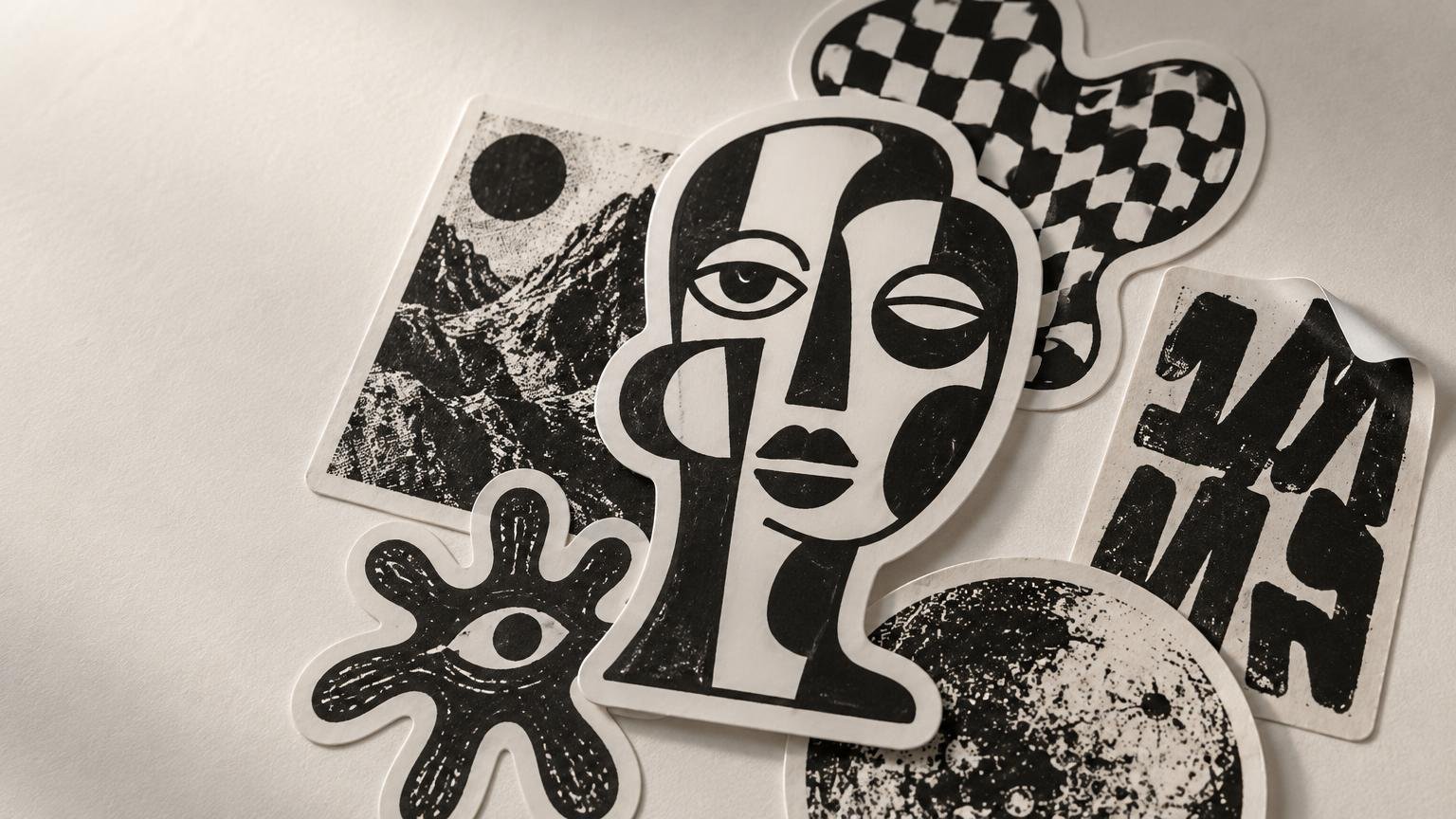
Black-and-White Sticker Art: Contrast Without Color
TLDR: Strong black and white sticker art is not simply a color illustration with its palette removed. It uses silhouette, line weight, negative space, texture, and lettering to create identity within a tight visual constraint. When browsing or collecting it, look for a recognizable visual system rather than assuming every high-contrast design belongs to the same style.
Black and white sticker art makes an artist’s decisions unusually exposed. Without hue to separate objects or direct attention, the composition has to negotiate every edge, gap, shadow, and patch of visual noise. That does not automatically make monochrome work clearer or better than color. It simply changes where the expressive work happens.
For collectors, that constraint creates a broad field rather than one fixed aesthetic. A precise botanical drawing, a rough photocopied face, an ink-heavy character, and a block of hand-cut lettering can all be monochrome while feeling completely unrelated. The useful question is not “Do I like black and white?” It is “What kind of black-and-white visual language do I want to follow?”
What makes black and white sticker art feel authored?
Authored work carries choices that feel connected. The outside shape supports the image. The line quality matches the subject. Empty areas are intentional rather than unfinished. Lettering belongs to the illustration instead of looking pasted on at the last minute. Even a rough sticker can feel considered when its roughness has rhythm and hierarchy.
These are the main features worth studying:
- Silhouette: Can you recognize the central form before inspecting its interior detail? A memorable outer shape can give a small sticker an immediate identity.
- Negative space: White areas can separate limbs, letterforms, facial features, or overlapping objects. When every gap closes up, the image may become one dark lump.
- Line weight: Thick contours can anchor a design while thinner interior marks describe texture. Uniform lines create a flatter, more diagrammatic effect.
- Black mass: Large areas of solid ink can establish weight and mood. Their placement also controls where the eye lands first.
- Texture: Hatching, stippling, dry-brush marks, halftones, and photocopy-like grain produce very different voices, even when the palette is identical.
- Typography: Lettering can act as caption, image, pattern, or signature. At sticker scale, its shape may matter as much as its literal message.
A useful way to judge a piece is to alternate between distance and close inspection. From a few steps away, notice the overall shape and dominant black-to-white balance. Up close, look at how the artist handles intersections, texture, and tiny marks. A design can reward both views, but it should not depend on microscopic detail to establish its main idea. For more criteria, see this guide to spotting strong sticker art at a small size.
Monochrome is a constraint, not a shortcut
Removing color does not solve composition. In fact, converting an existing illustration to grayscale or pure black and white can erase distinctions that originally depended on hue. Two differently colored shapes may collapse into the same value. A focal point may disappear. Fine lines may compete with the border.
Purpose-built monochrome work usually anticipates those problems. It separates forms through spacing, changes line weights, simplifies overlapping elements, or turns shadows into deliberate graphic shapes. A three-tone gray drawing and a pure two-tone image also behave differently: gray supports subtle modeling, while solid black and white demand harder decisions about what remains and what disappears.
That is why “high contrast” should not become a lazy synonym for “easy to read.” A dense black-and-white pattern can be intentionally disorienting. Tiny gothic lettering can be expressive even when it is not instantly legible. Readability matters when the message or character must register quickly; complexity can still be the point in work made for close viewing.
A compact historical example: Andre the Giant Has a Posse
Shepard Fairey states that the first Andre the Giant Has a Posse sticker emerged in Providence in 1989 amid skate and punk culture. In his account, the early design combined a small black-and-white image with simple text and became a vehicle for expression, circulation, and identity.
The example is useful because its visual ingredients are compressed: a face, stark lettering, a few numerical details, and a reproducible photocopy-like finish. The image does not represent all monochrome sticker art, and it should not be treated as the origin of the whole medium. It demonstrates one influential approach in which constrained imagery, repetition, and textual ambiguity work together.
It also shows why context matters. The same black-and-white palette can evoke punk flyers, skate graphics, underground publishing, comics, political graphics, tattoo flash, or formal pen-and-ink drawing. Monochrome is the shared mechanism, not proof that every artist belongs to the same scene. Readers interested in the broader timeline can continue with the history of sticker art and designer sticker culture.
Browse by visual language, not just subject
Search results for monochrome stickers often mix artist work, decorative packs, printable collage material, logos, and craft supplies. Subject filters such as skulls, cats, plants, or lettering can help, but they do not reveal much about how the art behaves. Browsing by visual treatment produces a more coherent collection.
| Visual language | What to notice | Collection effect |
|---|---|---|
| Minimal linework | Controlled contour, open space, selective detail | Calm, airy, and easy to compare across artists |
| Photocopy texture | Grain, uneven blacks, cut-and-paste edges | Raw, document-like, and connected to DIY graphics |
| Character-led ink | Distinct silhouettes, facial marks, recurring figures | Personality-driven and suited to artist-focused sets |
| Stark typography | Letterform shape, spacing, scale, image-text tension | Direct, rhythmic, and strong in mixed displays |
| Dense pattern | Repetition, hatching, optical movement, packed detail | Visually busy and rewarding at close range |
| Heavy black mass | Bold shadows, large filled areas, narrow white channels | Weighty, dramatic, and compositionally assertive |
Once you identify the treatment that holds your attention, follow the artist rather than continuing to collect random examples of the subject. An illustrator’s plant, portrait, and invented creature may belong together because they share the same contour and texture. Conversely, ten skull stickers can feel completely disconnected when every one comes from a different visual system. The broader guide to sticker art styles can help place these treatments alongside graffiti, lowbrow, indie illustration, and other traditions.
What makes a monochrome sticker pack coherent?
A good pack needs relationships, not uniformity. Repeating the exact same line weight, crop, and shape can make a set monotonous. The better approach is controlled variation: one large anchor image, a few medium character or symbol pieces, and smaller marks or lettering that change the pace.
For a black-and-white pack, compare the ratio of dark to light across the whole group. If every piece is a dense black rectangle, individual designs may compete when displayed together. Mixing an ink-heavy focal piece with more open line drawings gives the eye somewhere to rest. Repeated borders, textures, lettering styles, or characters can tie the set together without making every sticker a near duplicate.
- Look for a recurring visual rule, such as scratchy contour lines, rounded characters, or condensed lettering.
- Check whether each sticker works alone as well as within the set.
- Compare outer shapes; a mix of compact, tall, wide, and irregular silhouettes creates rhythm.
- Notice whether one design acts as the anchor or every piece demands equal attention.
- Ask whether the pack reveals an artist’s world or merely groups unrelated monochrome objects.
A single-artist pack often offers the clearest visual through-line, but a multi-artist selection can work when the curator establishes a narrower theme. The connection might be brushwork, horror-comic texture, hand lettering, or an unusually open use of white space. Our guide to what makes a sticker pack worth collecting explores that balance between cohesion and variety.
Collecting without applying every sticker
A sticker does not have to be placed immediately to have value as an art object. Keeping some pieces unused lets you compare editions, assemble artist-focused groups, trade duplicates, or change a display without sacrificing the original adhesive. It also prevents the familiar collector’s dilemma: putting the best piece on the first available notebook and regretting the decision two weeks later.
Storage can be simple. Keep unused work flat, clean, dry, and away from prolonged direct sunlight. Separate pieces whose surfaces or adhesives appear likely to catch against one another. Refillable sleeves or albums make browsing easier, while small labeled envelopes suit collectors who organize by artist, event, pack, or acquisition date. Avoid writing directly on the sticker backing if maintaining the piece matters to you; place notes on the sleeve instead.
For display, consider temporary arrangements in a frame, clear pocket, magnetic sleeve, or dedicated board rather than permanently applying every piece. Grouping monochrome stickers against a neutral background allows differences in texture and black density to remain visible. If the display includes color work too, use the black-and-white pieces as pauses or anchors rather than assuming they will automatically blend with everything.
Hatch Kingdom offers a useful example of archive-minded collecting. The organization says its collection contains about 30,000 stickers across categories including skateboarding, streetwear, music, politics, mixed material, and street art. It describes the street-art portion as spanning the 1990s to the present, with older material in other categories reaching back to the 1960s and 1970s. Its sticker collection overview is useful for seeing how categories can preserve cultural context rather than treating every item as an isolated graphic.
For artists: test the visual idea before production
If you are making monochrome stickers, begin with the image at approximately its intended viewing size rather than trusting a large canvas. Squint at it. Turn it upside down. Fill the silhouette with solid black. These quick tests expose weak focal points and awkward gaps without requiring a long technical workflow.
Then compare three versions: the full drawing, a simplified version, and a silhouette-led version with only essential interior marks. The simplest option is not automatically the winner. The exercise reveals which details carry identity and which merely survive because there was room for them in the original artwork.
Pay particular attention to the border. A white border can separate black artwork from a dark surface, while a black edge can make an open drawing feel more contained. A contour-cut shape may amplify a strong silhouette but expose every awkward bump in a weak one. The border is part of the composition, not packaging around it.
Only after the artwork works at sticker scale does production become the next task. Artists who have reached that stage can compare options for printing custom stickers, while keeping the creative decision—not the product specification—as the starting point.
Build a collection around decisions, not absence of color
The best way to explore black and white sticker art is to stop treating monochrome as one giant genre. Choose a visual question: clean contour or distressed texture? Character work or typography? Open white space or heavy black mass? Single-artist pack or cross-artist theme?
Start with five pieces and identify the rule connecting them. If the only answer is “they have no color,” refine the group. A strong collection makes the artists’ decisions visible. Black and white is merely the constraint that brings those decisions to the surface.