How Sticker Scale Changes Illustration Decisions
TLDR: Sticker scale is not only the physical size of the finished piece. It is also the size relationship among the character, lettering, props, setting, and surrounding space. A subject that nearly fills the shape can read as an emblem. The same subject made smaller may create room for atmosphere, narrative, or discovery. Set the intended focal point first, test the composition at actual size, and remove details that compete with that reading.
Imagine the same frog illustrated twice. In one version, its face fills almost the entire sticker, with two eyes, a blunt mouth, and a hard outer silhouette. In the other, the frog occupies a corner of a pond beneath oversized reeds and a wide moon. The character has not changed, but the invitation has: one image asks to be recognized immediately, while the other asks to be explored.
That contrast gets to the heart of how sticker scale changes illustration. The useful question is not simply, “How large will this sticker be?” It is, “How large should each element feel in relation to everything else?” That figure-to-field relationship can shift an idea from icon to scene, from statement to joke, or from instant hit to slow reveal.
What scale means inside a sticker illustration
In composition, scale describes relative size. The Nielsen Norman Group’s visual design principles guide explains that scale can signal importance and establish rank among elements. On a sticker, that hierarchy might involve a face, hand, flower, word, vehicle, background shape, or patch of open space.
Physical dimensions still matter, but they are a separate question. A large printed sticker can contain a visually tiny character. A small printed sticker can present an enormous face. Thinking in relationships prevents the design from becoming a merely shrunken illustration in which every object retained the same importance it had on a larger page.
A quick way to diagnose relative scale is to reduce the composition to five roles: primary subject, secondary subject, supporting detail, field or setting, and sticker silhouette. If three elements all demand the primary role, the viewer may not know where to begin.
How sticker scale changes illustration hierarchy
Relative size gives the eye a probable first stop. The largest element does not automatically win—contrast, color, placement, and familiar shapes also carry visual weight—but size is one of the clearest controls available. A pale oversized moon may sit behind a smaller black figure without taking over. A tiny red eye can interrupt a much larger gray face because its contrast is sharper.
Before refining texture, decide what should be noticed first, second, and third. Then perform a crude check: squint at the artwork or view a thumbnail. If the intended focal point disappears, making every line cleaner will not necessarily rescue the hierarchy. Changing the relative scale of the competing forms usually produces a more direct result.
| Intended reading | Scale move to try | Main risk |
|---|---|---|
| Immediate icon | Let one face, symbol, or silhouette dominate the field | The image may feel generic if distinctive details disappear |
| Tiny narrative scene | Reduce the figure and give the setting more area | The focal character may become difficult to find |
| Visual joke | Exaggerate one prop, word, expression, or gesture | Too many exaggerations can weaken the punchline |
| Atmospheric image | Use a small subject with deliberate open or environmental space | Low contrast can make the whole piece feel vague |
| Dense collectible | Layer several motifs but preserve one dominant form | Detail can collapse into texture at actual size |
When a large figure becomes an icon
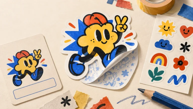
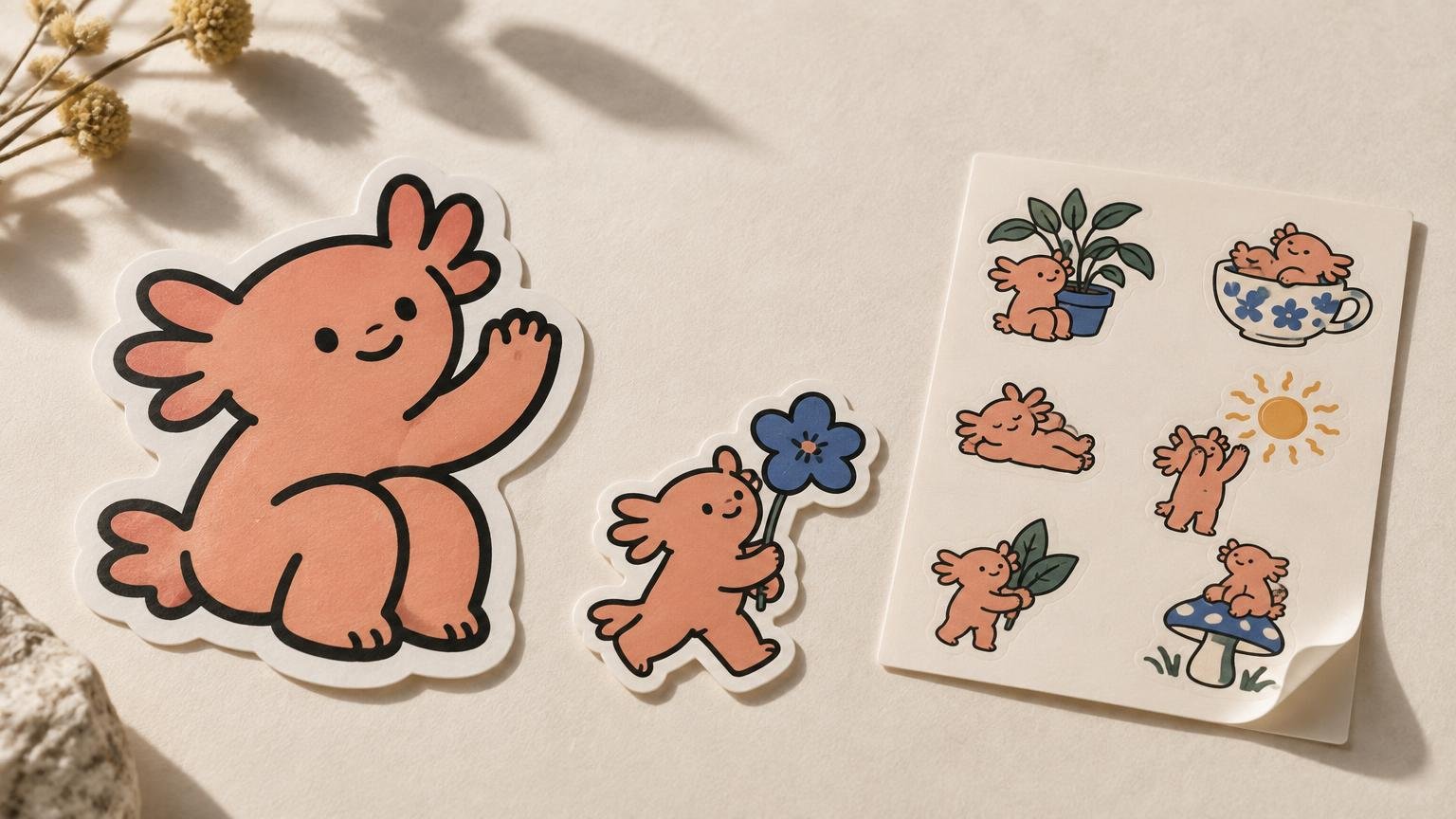
A character that nearly fills the sticker can feel immediate and emblem-like. The outer shape, face, or gesture becomes the identity of the object. This is useful when recognition matters more than setting: a mascot head, a gloved hand, a single creature, or a compact piece of lettering can often survive a passing glance because the main form receives most of the available field.
Large does not have to mean crowded. Letting a head occupy most of the sticker while preserving a narrow border of negative space can make the silhouette easier to read. Cropping can also add energy: ears breaking the top edge or a hand entering from one side may suggest a world beyond the cut shape. The important distinction is between an intentional crop and one that merely looks as though the artwork did not fit.
Collectors often respond to this kind of piece as a self-contained mark. It does not need neighboring stickers to explain it. For more ways to evaluate that quality, see these sticker design tips for spotting strong art at a small size.
When a small figure makes room for a story
Reducing the main character can change the setting from decoration into subject matter. A tiny astronaut beneath a large plant, a cyclist crossing a blank slope, or a cat surrounded by towering grocery items may imply distance, vulnerability, solitude, absurdity, or simple curiosity. These readings are possibilities rather than fixed emotional rules; pose, color, crop, and context still matter.
The challenge is keeping the small figure identifiable. Instead of preserving every interior feature, strengthen the pose, directional gesture, or silhouette. A miniature character carrying one oversized umbrella may remain clearer than the same character with individually drawn fingers, shoelaces, jacket seams, and facial features.
Treat the background selectively too. A scene does not require an inventory of everything that could exist there. One window, two stars, and a sloping ground line may establish place more effectively than a fully rendered city competing with the character.
Oversized props, words, and gestures
Disproportion is not a problem when it has a job. An enormous key held by a tiny person creates a different premise from a realistically scaled key. A hand larger than a character’s torso can turn a quiet pose into a graphic signal. One word occupying half the sticker can behave like a physical object rather than a caption.
Lettering deserves the same compositional attention as illustration. In a Street Art NYC interview, sticker artist Baser discussed internalizing balance, composition, and flow in his handstyle practice. That is a useful lens for type-led stickers: the word’s mass, slant, and rhythm matter alongside its literal meaning.
Try identifying the exaggeration in one sentence: “The giant spoon makes the character look ceremonially serious,” or “The oversized NO creates the wall that the figure is pushing against.” If the disproportion has no clear visual role, it may be enlargement without emphasis.
Negative space controls density
Open space is not unused sticker. It separates forms, protects the focal point, and controls the pace of looking. A small figure surrounded by open color can feel more prominent than a larger figure buried under equal-weight details. Conversely, a tightly packed composition can feel noisy, energetic, claustrophobic, or abundant when that density supports the idea.
Watch for accidental gaps that split the artwork into unrelated islands. Also check whether small holes, counters, and spaces between limbs remain meaningful when reduced. If two shapes merge, decide whether the new combined silhouette is stronger or whether the gap needs to become more generous.
Vary scale across an illustrated sticker pack
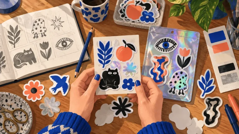
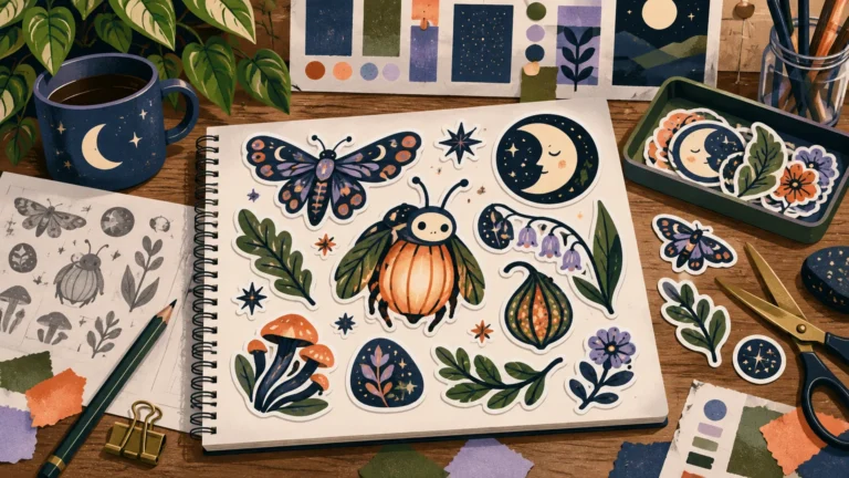
A coherent pack does not require every design to use the same figure-to-field ratio. Repetition at that level can make five distinct drawings feel like five color variants of one badge. Instead, create rhythm: one face-filling icon, one mid-distance character, one miniature scene, one type-led piece, and one quieter object can form a more satisfying sequence.
Coherence can come from elsewhere—shared line behavior, palette, recurring motifs, border treatment, humor, or character world. Scale variation then supplies tempo without dissolving the artist’s voice. The goal is controlled contrast, not randomness. A broader guide to building a desirable designer sticker pack can help connect these individual compositions into a release, while this explanation of what makes a vinyl sticker pack feel curated approaches the same decision from a collector’s perspective.
Illustrator Carmela Caldart described beginning with explorations of composition, scale, and poses before moving into color and texture. That is one artist’s workflow rather than a universal formula, but it offers a useful principle: solve the large relationships while revisions are still inexpensive.
Inspect the artwork at actual sticker size
Zooming in can make every whisker, texture mark, and background object feel essential. Actual-size viewing is less sentimental. It reveals which forms merge, whether the focal point still leads, and whether a tiny expression remains an expression rather than becoming visual grit.
- Identify what catches your eye first without zooming in.
- Check whether the silhouette remains distinct from the background.
- Look for small gaps that close and separate forms that unexpectedly merge.
- Compare a detailed version with one that removes a third of the secondary marks.
- View every design in a proposed pack together, at comparable physical scale.
- Ask whether a quiet or miniature element rewards close looking—or merely becomes invisible.
This is a creative check, not a demand for one universal line width or font size. Different styles tolerate different amounts of compression. If the artwork is moving from composition into production, a custom sticker printer can handle the practical ordering stage; the artist’s job first is to make the visual hierarchy intentional. For a pack-specific transition from art to physical pieces, see the guide to turning artwork into a small-run vinyl sticker pack.
Choose the relationship before polishing the details
The most useful scale decision happens before the final texture pass. Decide whether the sticker should behave like an emblem, a scene, a joke, a typographic object, or a tiny world that asks for a second look. Then size the figure, objects, words, and field around that purpose.
Start with one idea and draw three versions: a subject filling most of the shape, a balanced mid-scale composition, and a small subject inside a broad field. View all three at their intended size. The strongest option is not necessarily the one with the most detail; it is the one whose scale relationship makes the idea clear, distinctive, and worth looking at again.