How to design logo stickers on sticker paper or sheets — Design, Artwork, and Presentation
A logo sticker succeeds when the mark remains recognizable after it has been reduced, cut out and separated from the rest of the brand system. Designing one is not simply a matter of dropping a full-size logo onto sticker paper. Small lettering can close up, delicate lines can disappear, and an awkward cut shape can make a polished identity look like a tiny bumper sticker from a parallel universe.
Start with the peeled sticker at its intended physical size. Then decide whether it will appear alone, repeat across a sheet or join secondary icons in a small branded collection. The best result should work both as an individual object and as part of the sheet’s wider composition.
Design the logo for its peeled size
View the artwork at approximately the size someone will actually hold or apply it. A logo that looks balanced across a large monitor may become dense and fussy when reduced to a few inches. The critical questions are simple: Can you identify the shape immediately? Is the name readable? Do the interior gaps remain open? Does one element clearly lead the composition?
If the answer is no, create a sticker-specific version rather than shrinking the primary logo without mercy. Remove secondary taglines, enlarge important lettering and simplify thin internal details. A compact symbol may deserve its own sticker, while the full wordmark can occupy a wider design. This is adaptation, not vandalism; even established visual identities need to change posture when the canvas gets small.
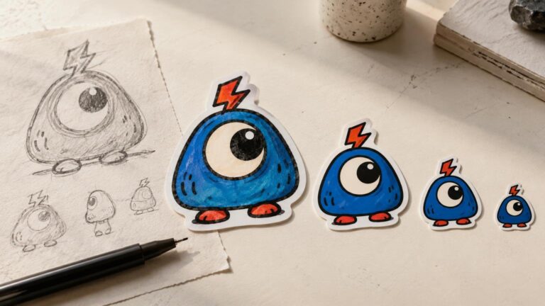
The same reduction principles used for illustration apply here. The guide to spotting strong sticker art at a small size explains why silhouette, contrast and readable detail matter, while the process for moving from hand-drawn art to stickers is useful when a logo includes illustrated or textured elements.
Let the cut shape support the mark
The outer contour becomes part of the logo sticker, even when it is not technically part of the logo. A circular emblem naturally fits a round cut. A long wordmark usually benefits from a horizontal contour. Character marks and irregular symbols can suit a closer die-cut shape, provided the outline does not create fragile spikes or distracting bumps.
A border can solve several visual problems at once. It separates a dark logo from a dark application surface, gives loose elements a unified silhouette and creates breathing room around lettering. The border does not have to be white: a brand color, dark keyline or layered border can feel more intentional. Keep it visually consistent around the mark unless deliberate asymmetry is part of the design.
Do not confuse this visible border with bleed. A border is part of the finished appearance. Bleed is extra artwork extending beyond the intended cut edge so small cutting variations do not expose an unintended gap. Adobe’s explanation of print bleed recommends extending artwork beyond the trim and following the print provider’s specifications.
Compose the whole sticker sheet
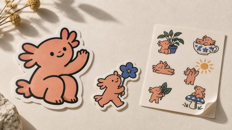
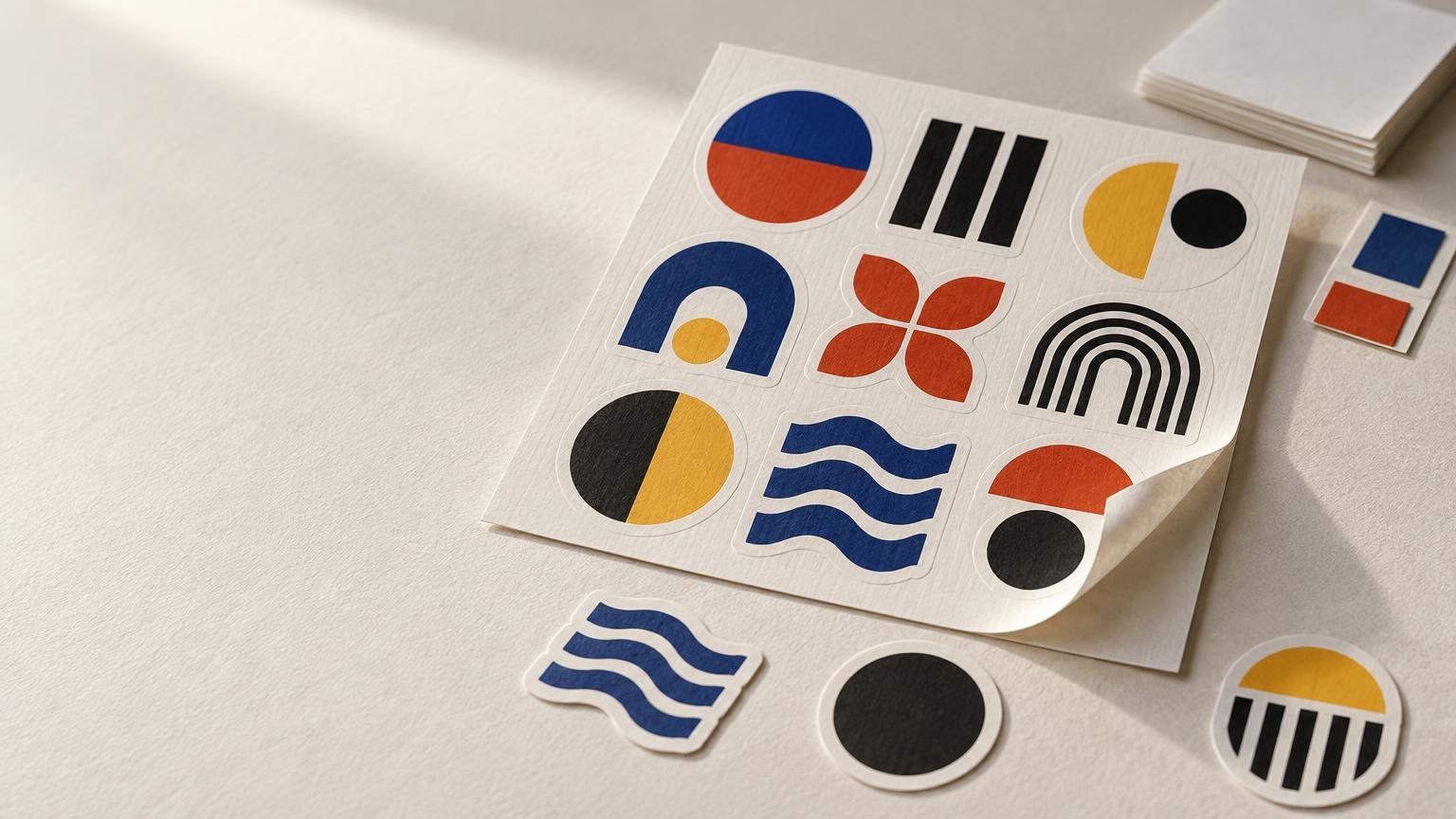
A sticker sheet is more than convenient real estate. It is a miniature composition whose individual pieces happen to peel away. Kiss cutting cuts the sticker faces while leaving the shared backing intact, allowing several designs to occupy one sheet. That exposed backing creates a frame around the collection and should be treated as part of the presentation.
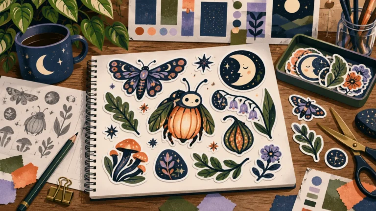
Begin with one dominant sticker. This might be the full logo, a mascot or the most recognizable symbol. Use smaller marks, monograms, icons or short phrases to establish rhythm around it. Repetition can reinforce identity, but a sheet containing eight identical logos often feels more like inventory than a designed object.
- Give the primary mark the most visual weight instead of making every piece equal.
- Mix shapes deliberately: one wide wordmark, several compact symbols and a small accent can create useful variety.
- Keep related stickers aligned through consistent borders, line weight or color treatment.
- Leave enough open space for each cut shape to read independently.
- Use the backing color or pattern as a frame, not as competition for the stickers.
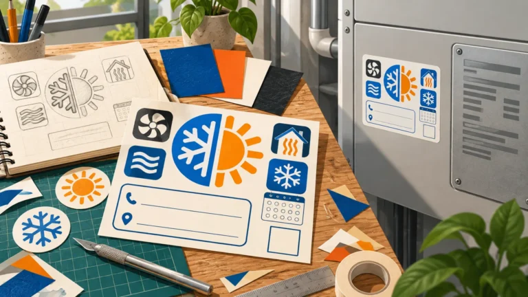
A mixed sheet can also function like a tiny identity kit. One sticker carries the complete logo, another offers a social avatar or monogram, and smaller pieces provide supporting shapes. The collection stays coherent because the pieces share visual rules, not because they are clones.
Prepare artwork without losing its character
Vector artwork is ideal for clean logos because paths and shapes can be resized without turning their edges jagged. Raster textures, glows and painted details need enough resolution at the final physical size. Adobe identifies 300 ppi as Illustrator’s high raster-effects setting, while also noting that higher resolution increases file size and processing demands. Review Adobe’s rasterization guidance before exporting artwork that relies on those effects.
Keep important lettering and fine details away from the anticipated cut edge. Close intended cut contours, remove stray points and inspect transparent areas that may disappear against an unfamiliar surface. A transparent preview is useful, but also place the design temporarily over black, white and midtone backgrounds. A logo that works only on the artboard’s default white has not finished auditioning.
Ask the chosen printer which file format, color mode, bleed and spacing it requires. These details vary by workflow. A PDF can preserve typographic fidelity without requiring the receiving party to have the original font files, according to Adobe, although converting finalized logo lettering to outlines can provide another controlled handoff. Keep an editable master file before outlining anything.
Choose paper, material and finish for the visual job
“Sticker paper” can mean printable adhesive sheets used with a home printer or simply the backing sheet that holds professionally produced stickers. Decide which format you mean before building the layout. Home sheets may impose preset label shapes or margins; a custom kiss-cut sheet can arrange multiple contours within one larger format.
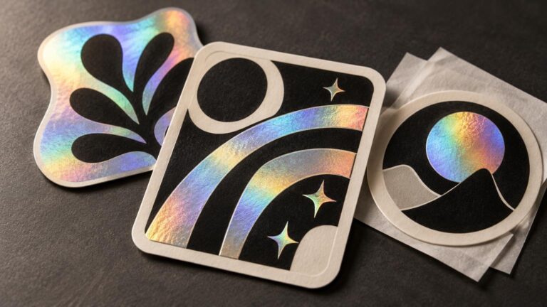
Material changes how the logo feels. A matte or paper-like surface can soften an identity built around drawing, craft or restrained color. Gloss can strengthen hard-edged color and polished graphic forms. Transparent material can make a simple mark feel integrated with the application surface, but pale colors and open negative space need careful consideration. The broader guide to choosing between paper, vinyl, clear and specialty sticker materials can help connect the surface to the artwork rather than treating material as an afterthought.
Confirm you can use the logo
Use a logo you own or have permission to reproduce. The U.S. Patent and Trademark Office explains that a trademark may be a word, phrase, symbol, design or combination identifying the source of particular goods or services. A familiar symbol found online is not automatically free to turn into stickers.
Copyright and trademark are related but distinct. The U.S. Copyright Office says names, titles, slogans and short phrases are not protected by copyright alone, although original logo artwork may be copyrightable and a logo may also receive trademark protection. For client work, confirm approval for the exact artwork and intended use before ordering a run.
Proof the sticker as an object, not only as a file
Before production, print a paper mock-up at actual size and cut it out roughly. Place it on the kinds of objects where it may appear. This low-tech step quickly reveals unreadable type, weak contrast, an oversized border or a contour that looked elegant only while surrounded by an artboard.
Review the production proof for scale, orientation, cut position, spacing and any treatment applied to the exposed sheet backing. A design reaching the cut edge and a graphic printed across the surrounding sheet are separate choices. Confirm both instead of assuming the printer will interpret the composition from context.
When the artwork and sheet layout are ready, CustomStickers provides custom sticker, material and artwork-preparation options; see details. Confirm the current template and proof process for the specific product before submitting final files.
Make the sheet feel like a miniature brand world
The strongest logo sticker is not necessarily the one containing the most brand information. It is the version that preserves the identity’s most recognizable shape, color relationship or typographic gesture at a small size. On a sheet, let that primary mark lead and use secondary pieces to build rhythm around it.
Reduce the design at the beginning, not after every decorative decision has been made. Test the silhouette, choose a contour that belongs to the mark, and give the sheet enough open space to breathe. A logo sticker should look intentional after it is peeled away—and the sheet should still feel designed before anyone touches it.