Graduation and Congratulations Stickers — Design, Artwork, and Presentation
TLDR: The strongest graduation and congratulations stickers celebrate a particular person, not graduation in the abstract. Start with where the sticker will be used, choose one dominant visual idea, and personalize it through lettering, color, a meaningful object, or a small detail from the graduate’s story. For a collection, build around one hero design and vary the supporting shapes, messages, and scale.
Graduation and congratulations stickers can do more than place a tiny mortarboard beside the words “You did it.” They can seal a card, turn a plain party favor into a keepsake, or give the graduate a small piece of artwork tied to a specific achievement. The useful question is not simply what looks festive. It is what will feel personal and still read clearly when reduced to sticker size.
Choose the sticker’s job before choosing the artwork
A design intended for a card envelope has a different job from one meant for a laptop or keepsake box. An envelope seal needs an immediate shape and very little text. A collectible die-cut can support a more unusual silhouette or illustration. A party-favor sticker may need to coordinate with several objects without dominating all of them.
| Sticker role | Best visual approach | What to avoid |
|---|---|---|
| Card or envelope seal | Compact badge, initials, year, or short congratulatory phrase | Long messages and delicate edge details |
| Gift-wrap accent | Bold icon, ribbon shape, starburst, or expressive lettering | Colors that disappear against the wrapping paper |
| Party favor | A repeatable mini-mark connected to the graduate or event | Too many unrelated themes across the same table |
| Personal keepsake | Name, year, major, character, or meaningful object | Generic imagery with no connection to the graduate |
| Coordinated mini-pack | One hero sticker with smaller type, icon, and filler designs | Five stickers that all use the same badge layout |
A single die-cut sticker is usually better when one memorable image can carry the occasion: a distinctive character, a hand-lettered name, or an object closely associated with the graduate. A sheet or mini-pack makes more sense when the stickers will be divided among envelopes, favors, gifts, and keepsakes—or when several messages are part of the fun.
Five visual directions for graduation and congratulations stickers
1. The bold badge
A badge turns the achievement into an emblem. Use a strong outer shape, a short phrase, and one supporting symbol. A circular seal might combine the graduation year with a star or rolled diploma, while a shield shape could frame initials and a field of study. The outer contour should remain recognizable even before the lettering is read.
2. Typography as the celebration
Lettering can be the whole image. “Congrats,” “You did it,” or the graduate’s name can become a compact composition through stacked words, an arched baseline, oversized initials, or a ribbon-like script. For small stickers, contrast beats complexity: one expressive display style paired with a plain supporting style is generally clearer than three decorative alphabets competing for attention.
3. A character with a point of view
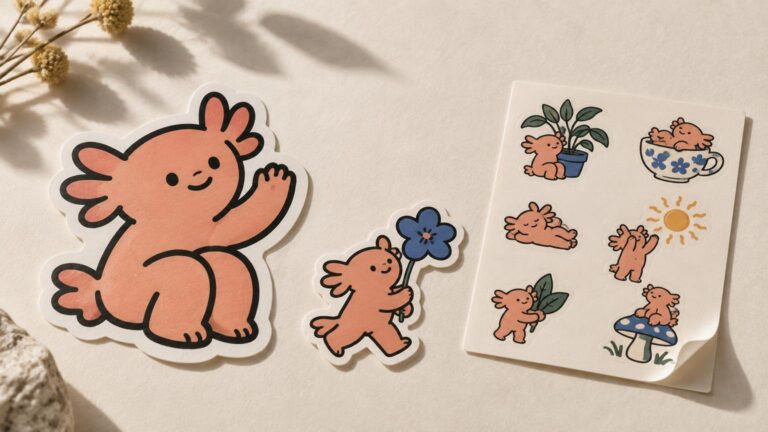
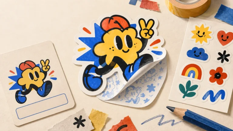
A character sticker can feel warmer than a formal seal. It might show an original creature balancing a cap, carrying an absurdly large diploma, or slumping beside a triumphant stack of books. The expression and pose should tell the story quickly. If the face only works after zooming in, simplify the features and exaggerate the silhouette.
4. The tiny narrative scene
A small scene can capture the moment before or after the ceremony: shoes under a gown, a cap tossed into a field of stars, or a desk transforming into a celebratory stage. These designs reward a closer look, but they still need a dominant focal point. Use fewer background objects than you would in a poster or full-page illustration.
5. The personal marker
Personalization does not have to mean placing a name in a template. A microscope, mixing console, paintbrush, welding mask, game controller, favorite flower, or familiar campus object may say more about the graduate than a generic diploma. Combine one such marker with the year or a short message, then let it carry the design.
Build a small collection instead of repeating one idea
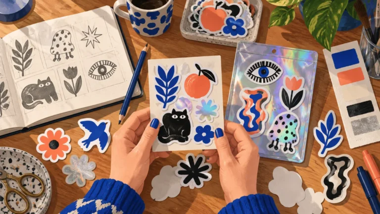
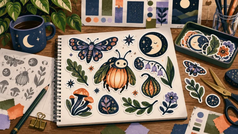
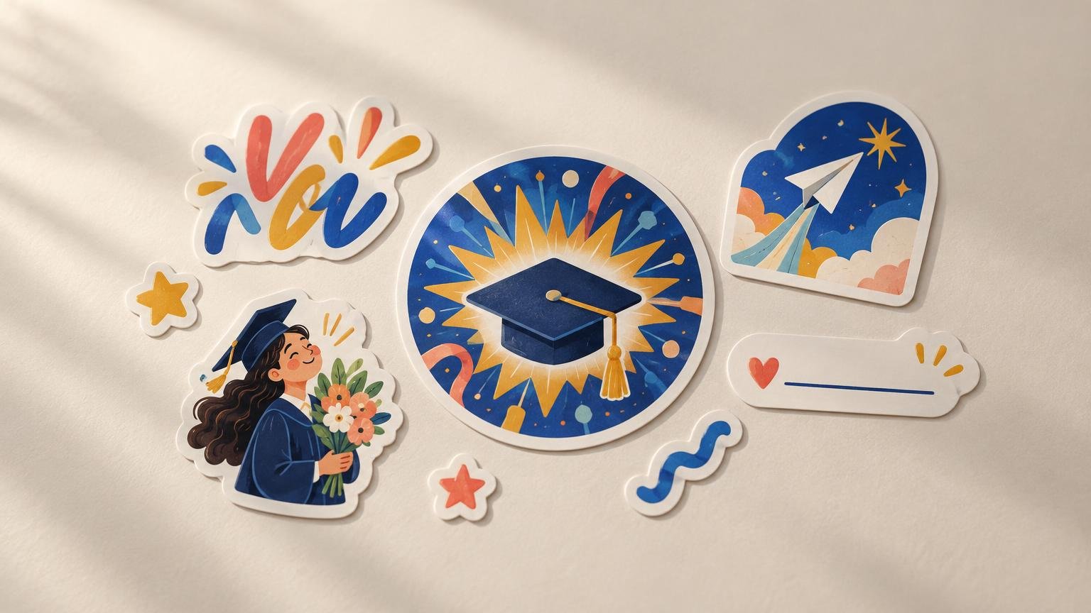
A cohesive graduation pack needs both unity and rhythm. The stickers should look related, but they should not feel like the same badge resized five times. A practical structure is one hero design, one message-led design, one object or character, one seal, and two or three tiny fillers.
- Hero sticker: the largest or most detailed design, centered on the graduate’s name, character, or defining object.
- Message sticker: a short phrase with typography strong enough to work without illustration.
- Object or character: a recognizable image that adds personality and changes the pack’s silhouette.
- Seal: a compact design using the year, initials, or a brief congratulatory message.
- Fillers: small stars, confetti forms, flowers, books, sparks, or original icons drawn in the same visual language.
Keep the collection together through two or three recurring devices: the same dark outline, a limited palette, repeated corner shapes, or one lettering family. Then vary the scale and density. One sticker can be loud and tightly packed while another leaves plenty of negative space. That variation makes a pack useful across cards and gifts while preserving a shared identity. The same curation principles used to judge a strong cohesive sticker pack apply here: variety should feel intentional rather than random.
Test every design at actual sticker size
Artwork can look perfectly clear while filling a monitor and turn into decorative porridge when reduced. Review the composition at its intended physical dimensions, not only while zoomed in. The focal shape, main words, and emotional cue should survive first; texture and minor props come later.
- Identify the one element that must be understood immediately.
- Reduce the artwork to its planned size and read it from a normal viewing distance.
- Check whether counters in letters, facial features, and narrow gaps remain distinct.
- Remove lines and objects that merge into neighboring shapes.
- Confirm that the outer contour still looks deliberate as a cut shape.
- Print a simple paper-size test if the final dimensions are difficult to judge on screen.
This does not mean every sticker must be blunt or minimal. A miniature scene can invite close looking, while a bold badge can work from farther away. The key is deciding which experience you want. Our guide to how sticker scale changes illustration decisions explores how focal points, relative scale, and detail affect that choice.
Make the lettering survive the celebration
Graduation designs often ask type to do too much: name, year, school, major, honors, quotation, and congratulatory phrase, all inside a tiny cap shape. Establish a hierarchy instead. The name or main message gets the strongest size and contrast. The year is secondary. Everything else must justify the space it occupies.
Also check the awkward details before printing. A long surname may need a wider composition rather than smaller letters. Numerals can create uneven gaps. Script capitals may collide with neighboring characters. Names, credentials, and graduation years deserve a character-by-character proofread; celebratory punctuation cannot rescue a misspelled degree.
Reference a school without copying its identity
School colors can provide an immediate connection without reproducing a logo, seal, mascot, or official lockup. Use the colors in an original character, abstract pattern, floral arrangement, or typographic composition. Adding a neutral tone or changing the color proportions can keep the result from looking like unofficial institutional merchandise.
Creators planning to sell stickers should check the relevant institution’s current trademark and licensing rules. As one example, the University of Connecticut’s trademark policy requires approval for commercial products using university marks and restricts alteration of those marks. Policies differ by institution, so permission in one setting should not be assumed in another.
A personal design based on the graduate’s major, interests, or experience is often more distinctive anyway. “Marine biology graduate who draws strange fish” offers much richer material than another unaltered school emblem.
Check ceremony rules before decorating a graduation cap
Never assume a sticker or topper is permitted on a mortarboard. Commencement rules are institution-specific and can conflict sharply. Kansas State University publishes guidelines permitting limited decoration on the flat top of the mortarboard, while Vanderbilt University’s commencement policy prohibits personal decorations on caps and gowns. Check the graduate’s current ceremony instructions before designing, applying, or gifting cap decorations.
If decoration is allowed, treat the cap as a distant-viewing surface. Large lettering, a simple silhouette, and strong value contrast will read better than a cluster of tiny stickers. Also consider whether the design needs to be removable so the cap can remain unchanged after the celebration.
Final checklist before custom printing
Once the original artwork is finished, a short preflight catches most avoidable problems. This is where visual decisions meet production without letting manufacturing jargon take over the project.
- Confirm the final dimensions and inspect the artwork at that size.
- Proofread every name, year, credential, and short message.
- Check whether thin lettering and small negative spaces remain open.
- Decide whether the artwork should follow a distinctive outer silhouette or use a simpler geometric shape.
- Choose a finish that supports the art rather than distracting from it.
- Verify that the intended surface, presentation, and quantity match the sticker’s role.
- Review any printer proof carefully, especially the cut line around narrow points and interior gaps.
For readers ready to move from finished artwork to production, custom graduation stickers are a practical next step. The supplied product guidance describes die-cut stickers as the default, offers matte and gloss options, and recommends submitting artwork at 300 ppi at full size; verify the current specifications and ordering details before placing an order.
Make the achievement specific
Memorable graduation and congratulations stickers do not need every familiar symbol at once. Choose the sticker’s role, identify one visual idea, and connect it to the person being celebrated. A name arranged beautifully, an odd little character, or one well-chosen object can carry more feeling than a crowded pile of caps, diplomas, stars, ribbons, and confetti.
Start by sketching one hero sticker at its intended size. If it still feels clear and personal when viewed small, build the supporting collection around its palette, line language, and mood. That is how a routine congratulatory label becomes a tiny piece of visual culture worth keeping.
References
- University Logo and Trademark Policy | University Policies | Office of University Compliance | University of Connecticut
- Cap Decoration Guidelines | K-State | Kansas State University
- Adornment Policy | Commencement | Vanderbilt University
- Custom Vinyl Stickers | Waterproof and Durable – CustomStickers.com