
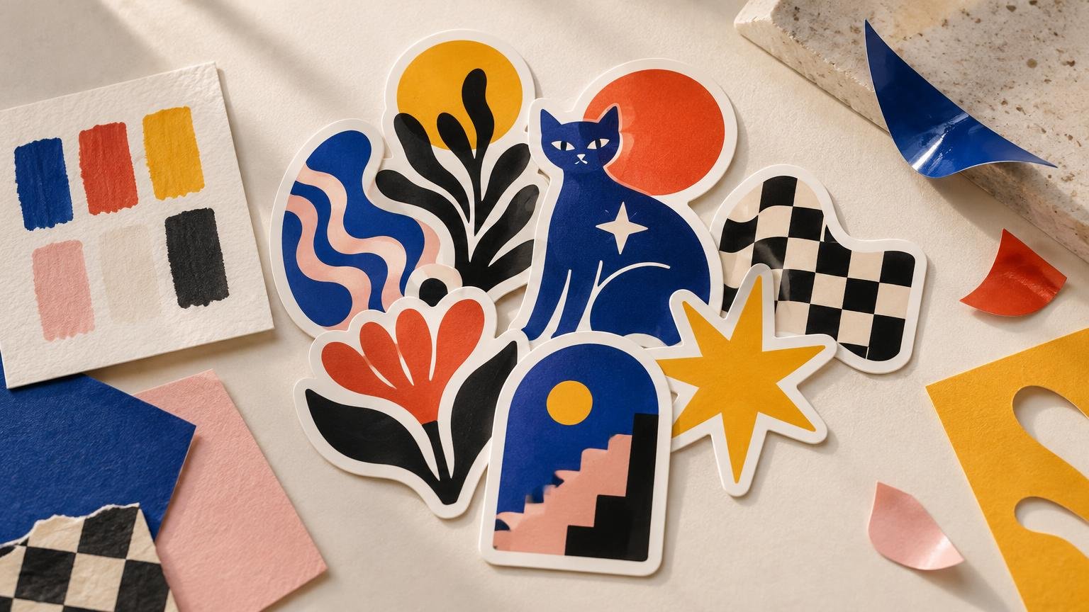
How to Choose a Color Palette for a Sticker Pack
A strong sticker pack color palette does two jobs at once: it makes the set feel related, and it gives each sticker enough contrast to hold its own. Too little control produces a pile of unrelated illustrations. Too much control can make five designs look like minor variations of the same sticker.
The useful middle ground is not necessarily a fixed set of three perfect swatches. It is a repeatable color logic: certain colors return, certain relationships stay consistent, and variation happens deliberately. The palette should help a collector recognize the pack from across a table without making every piece interchangeable.
Choose the pack’s visual job first
Before selecting colors, decide what should connect the stickers. A character pack might use changing costumes while preserving one signature body color. A botanical set might shift through seasonal hues while repeating the same dark green. A typography pack may need a limited background system so the letterforms remain dominant.
This decision matters because color cannot rescue a pack whose core idea is unclear. If the stickers have no shared subject, drawing style, shape language or mood, forcing the same four colors onto them may create superficial consistency rather than a genuine collection.
Start by describing the pack in one short phrase, such as “acid-bright nocturnal creatures,” “quiet kitchen objects” or “red, cream and black protest graphics.” That phrase gives color a purpose. It also makes it easier to remove a beautiful swatch that belongs in another project.
Pick a palette structure, not just favorite colors
Several palette structures work well for sticker packs. The right choice depends on whether the individual pieces need to match closely, form a sequence or display a recognizable signature.
- Bounded colorway: Every sticker draws from the same small group of colors. This creates immediate cohesion and suits graphic work with bold silhouettes.
- Dominant signature color: One color appears throughout the pack while secondary hues change. This can build recognition without making the set visually flat.
- Distributed sequence: Each sticker owns a different section of a larger gradient, spectrum or progression. The full idea becomes clearest when the pieces are shown together.
- Shared neutrals with changing accents: A repeated black, cream, gray or dark brown holds the pack together while brighter colors rotate between designs.
- Controlled full color: Illustrations use many hues, but saturation, value range or temperature stays consistent. This is flexible, although it requires a stricter editing eye.
Real artist packs use more than one of these approaches. OBEY Giant’s Sticker Pack 5 presents 13 designs in a blue, red, cream and black colorway, demonstrating how a bounded palette can unite varied graphics. You Are Beautiful’s Prism set instead distributes a continuous color sweep across 10 stickers built around five connected colors. Neither method is automatically stronger; one emphasizes a shared graphic system, while the other makes sequence part of the collection.
Build around an anchor, accents and a neutral
A practical starting palette has one anchor color, one or two accents and at least one neutral or near-neutral. The anchor carries the pack’s identity. Accents create focal points and distinguish individual stickers. The neutral gives the eye somewhere to rest and can support outlines, shadows, type or borders.
These roles do not need equal coverage. If electric orange is the anchor, using it on every sticker may be enough; it does not need to occupy half of every composition. Repetition can be tiny but strategic: the same eye color, corner mark, outline or background detail may connect otherwise different pieces.
A signature color can become part of an artist’s public visual identity. Street Art NYC described the bright-yellow stickers of My Life in Yellow as part of New York’s visual landscape, while the artist explained that yellow had held personal meaning long before becoming central to the work. That is a useful reminder that palette can carry memory and authorship, not merely decoration.
Test contrast at actual sticker scale
A palette that looks rich on a large monitor can turn to soup when reduced. Similar midtones merge, thin colored lines disappear, and small lettering loses authority. Test every design at its intended physical dimensions and as a small shop thumbnail. If the focal point becomes hard to find, adjust value contrast before adding more saturation.
Try three quick checks: view the design in grayscale, blur or squint at it, and place it beside the other stickers at equal scale. Grayscale reveals weak value separation. Blurring exposes whether the main shape survives without detail. The group view shows whether one sticker shouts while the rest mumble.
For designs containing functional text, the W3C’s explanation of minimum contrast provides a useful digital reference: WCAG specifies a 4.5:1 contrast ratio for normal text and 3:1 for large text because hue alone is not a dependable readability cue. Those thresholds govern web content, not physical sticker art, but they are relevant to online product images and a sensible warning against relying on color difference alone.
Create variation without breaking the family
Once the core palette works, assign colors across the pack rather than finishing each sticker in isolation. Put all designs on one page and look for accidental clusters. If three stickers are mostly blue and one is aggressively pink, decide whether that outlier is a deliberate centerpiece or simply an unresolved decision.
A simple distribution pass can keep the set lively:
- Repeat the anchor color somewhere in every design.
- Give each accent at least two appearances unless a single use is intentionally special.
- Alternate light- and dark-dominant stickers to create rhythm.
- Avoid placing the same dominant color on adjacent pieces in a planned display or backing card.
- Reserve the highest-contrast combination for the design that should lead the pack.
Variation can also come from materials and formats rather than additional hues. In a Street Art NYC interview, handstyle artist Baser connected using a wider variety of labels with a need to “broaden the palette.” The observation is useful beyond street labels: shape, substrate and border treatment can expand a visual system without turning the color scheme into confetti.
Edit for collectors, not just for a mood board
A pack is encountered as both a group and a set of separate objects. Each sticker should therefore pass two tests: does it contribute something distinct to the collection, and would it still be desirable on its own? A filler design cannot hide forever behind coordinated colors.
This is where palette decisions meet the broader question of what makes a sticker pack feel worth buying or trading. If two pieces share nearly identical composition and color balance, change one more substantially or remove it. Cohesion is valuable; duplication wearing a different hat is not.
Color also affects how a pack fits into an existing collection. Someone building a tightly organized display may prefer a limited colorway, while a collector filling a sketchbook spread might want a sequence with wider movement. The principles in starting an intentional artist-sticker collection apply here too: visual direction is more useful than accumulating unrelated pieces because each one looked appealing for five seconds.
Use a repeatable palette workflow
- Write one phrase describing the pack’s visual mood and subject.
- Choose a palette structure: bounded, signature-led, sequential, neutral-led or controlled full color.
- Select an anchor, accents and a neutral based on their roles rather than equal swatch coverage.
- Apply the colors to rough versions of every sticker on one page.
- Test the set in grayscale, at physical size and as small thumbnails.
- Adjust color distribution across the group, then remove redundant designs or hues.
- Review the final art on more than one screen and, when possible, with a physical color proof before approving production.
Screen previews are not promises of exact physical color. Artist Isabelle Algrin’s sticker-pack listing, for example, warns that displayed colors can differ from the received item because of screens. Keep that variation in mind when a palette depends on several nearly identical shades. A pack built around clear relationships—light versus dark, warm versus cool, anchor versus accent—is generally easier to preserve than one whose entire effect rests on tiny screen-level differences.
Once the visual system is settled, artists moving from artwork to production can compare options for custom sticker printing. That step should follow the palette edit, not substitute for it. A polished finish will not make an incoherent set feel curated.
Make the palette recognizable, then let it breathe
The best sticker pack palette is not the one with the most fashionable swatches. It is the one that gives the collection a recognizable voice while allowing each piece to earn its place. Choose a clear structure, repeat one or two visual signals, test contrast at small scale and edit the full group rather than treating every sticker as a separate canvas. If the pack reads as a family before anyone studies the details, the color system is doing its job.
References
- OBEY STICKER PACK 5 – OBEY GIANT
- You Are Beautiful – Official Stickers & Public Art
- Speaking with NYC-Based Multidisciplinary Artist “My Life in Yellow”
- Understanding Success Criterion 1.4.3: Contrast (Minimum) | WAI | W3C
- Web Content Accessibility Guidelines (WCAG) 2.2
- interview with handstyle master and prolific NYC sticker artist Baser
- Sticker Pack – x10 Potion Bottles — Isabelle Algrin Art