Sticker-Bomb Composition: How to Make Chaos Look Intentional
A good sticker bomb should feel as though it grew through collisions: characters interrupting lettering, tiny icons filling awkward corners, loud colors competing for the last inch of space. Yet convincing chaos is rarely the same as random placement. The strongest arrangements give the eye something to notice first, something else to discover later and enough visual rhythm to keep the whole surface from becoming wallpaper.
There is no formal design standard called “sticker bomb composition.” The useful framework comes from broader composition principles such as hierarchy, contrast, repetition, proximity, proportion, balance and negative space. Purdue University Libraries offers a useful introduction to these basic design principles, while the University of Wisconsin–Madison’s guide to contrast, repetition, alignment and proximity provides another practical vocabulary for organizing dense graphics.
Begin with an anchor, not a grid
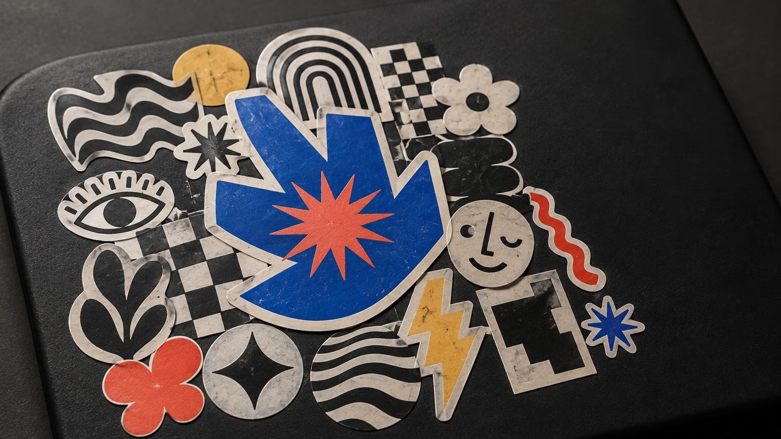
Choose one to three anchor pieces before filling the surface. An anchor can be the largest sticker, but it can also be the face with the strongest expression, the brightest patch of color or the only piece with oversized type. Its job is to establish an entry point. Differences in scale, color, spacing and contrast influence what viewers notice first, so a dominant element can create hierarchy without forcing the composition into neat rows.
One anchor produces a poster-like arrangement. Two anchors create a visual exchange across the surface. Three can form a loose triangle that moves the eye around the field. More than that is possible, but if every large sticker demands top billing, none of them wins. Save some energetic designs for supporting roles.
Do not automatically place the main piece in the center. An off-center anchor often suits sticker bombing better because it leaves unequal spaces to solve. Those wedges and narrow channels become opportunities for smaller art rather than signs that the layout failed geometry class.
Build in size layers
Think in three rough scales: anchors, connectors and fillers. Anchors establish emphasis. Medium-sized connectors carry color, line or subject matter from one part of the composition to another. Small fillers occupy corners and seams while adding texture. Larger or higher-contrast elements generally attract more attention; smaller elements can connect those dominant forms and reward close viewing.
The categories do not need exact measurements. They need visible differences. If every sticker is nearly the same size, the result tends to resemble a tiled collection rather than a bombed surface. That can be attractive, but it creates a different rhythm. Exaggerating the jumps between large, medium and tiny pieces gives the arrangement more depth.
Use overlap to connect, not conceal
Overlap is common in sticker bombing, but it is not a universal requirement. Dense arrangements can also be built through close proximity, layered borders and interrupted gaps. When you do overlap, cover visually expendable areas: an empty background, an oversized border, a repeated texture or the tail of a word that remains legible.
Avoid repeatedly burying faces, signatures and the distinctive part of a silhouette. One partially hidden element suggests layering; ten mutilated focal points suggest that placement happened faster than thought. Before applying anything permanently, test the arrangement using backing paper, removable mock-ups or photographs of the loose layout.
Vary the depth of overlaps. A tiny corner crossing can connect two pieces. A medium overlap can make one sticker appear to sit clearly above another. A rare, aggressive overlap can create a burst of energy. Using the same overlap depth everywhere turns layering into another grid.
Repeat visual traits without repeating the same sticker
Coherence does not require one artist, one theme or one relentlessly beige palette. Repeated colors, shapes, textures, borders and typographic treatments can link otherwise distinct elements. Contrast keeps those elements distinguishable inside the crowd.
Pick two or three recurring traits. A composition might repeat acid green in five separated locations, alternate black-and-white drawings with saturated characters, or echo circular eyes with round logos and curved lettering. The recurrence should be noticeable after a moment, not announced with a megaphone.
Monochrome pieces are especially useful as visual punctuation between competing colors. The strong contours discussed in this guide to black-and-white sticker art can provide structure without introducing another palette. Likewise, understanding what makes sticker art readable at a small size helps when selecting fillers that will not dissolve into visual grit.
Leave quieter areas inside the noise
Negative space does not have to mean exposed background. In a sticker bomb, a quiet zone might be a simple two-color design, a broad border, several similarly toned pieces or a gap that remains uncovered. Unoccupied or visually restrained areas clarify hierarchy and give the eye room to move. Complete coverage and compositional clarity are not the same goal.
Try squinting at the layout or viewing a phone photo as a thumbnail. If it becomes one uniform block, create separation around an anchor or replace a fussy connector with something simpler. If one corner appears detached, repeat a color or shape from that corner elsewhere. This is also a useful moment to rotate pieces: diagonals generate movement, while a few horizontal or vertical elements keep that movement from becoming a whirlpool.
Edit the collection before committing it
Composition begins with selection. A pile containing twelve unrelated palettes, six competing type styles and no repeated visual traits makes cohesion unnecessarily difficult. Start with more stickers than the surface can hold, then remove pieces that duplicate a role without adding anything new.
- Keep at least one obvious anchor and several quieter supporting pieces.
- Distribute repeated colors rather than clustering every matching sticker together.
- Separate two intricate designs with a simpler shape, border or monochrome piece.
- Check that important text remains legible after overlap.
- Photograph two or three candidate layouts before choosing one.
- Set aside good stickers that weaken this particular composition; rejection is not a quality judgment.
Collectors who keep unused work intact may prefer to arrange scans or removable placeholders rather than sacrifice original artist stickers. A collection can also be organized into smaller themed groups before any permanent display is attempted; this guide to collecting artist stickers intentionally offers a useful starting point.
Respect the art and the surface
Using physical stickers in a personal arrangement is different from copying artists’ images to manufacture a new collage. The U.S. Copyright Office identifies stickers, decals, collages, illustrations and graphic designs as visual-art categories, and explains that original work generally receives copyright protection when fixed. Its visual-arts guidance is a useful starting point. Selection and arrangement do not automatically grant rights in the underlying artwork, so obtain permission before reproducing other artists’ designs in a product or printed collage.
Placement permission matters too. Use your own objects, removable display panels, sketchbook pages or surfaces whose owner has approved the installation. Municipal definitions of graffiti commonly turn on whether a marking was made without the owner’s permission; Bellevue’s guidance provides one official example. Bellevue’s graffiti information
If the designs are your own and you are ready to turn them into physical pieces, customstickers.com provides custom sticker, material and artwork-preparation options. Keep the production decision downstream of the composition: first decide which silhouettes, scales and colors the layout actually needs.
The final test is movement
Stand back and trace where your eye travels. It should land somewhere, move through a few connected areas and find smaller surprises without getting trapped in one noisy cluster. If the path feels flat, change scale. If it feels fragmented, repeat a color or shape. If it feels suffocating, introduce a quiet patch.
Intentional sticker-bomb composition does not make chaos polite. It gives chaos pacing. Keep the collisions, awkward angles and mismatched personalities—but make each one contribute to the larger field.
References
- Start Here – Design Basics – Research Guides at Purdue University Libraries
- CRAP Principles – DesignLab – UW–Madison
- Full article: SOCIETY FOR POST MEDIEVAL ARCHAEOLOGY POSTGRADUATE DISSERTATION PRIZE WINNER 2022 Protest, persuasion, promotion: exploring the relationship between graffiti stickers and social media communities
- Visual Arts Examples
- Help: Limitation of Claim | U.S. Copyright Office
- Graffiti | City of Bellevue