Sticker packs: how to create a coordinated set — Design, Artwork, and Presentation
A coordinated sticker pack needs more than several good illustrations placed in the same envelope. It needs a visual premise, a few repeated design rules, and enough variation to keep the set lively. The best packs feel related without looking like six color-swapped copies of one sticker.
Start by deciding what holds the set together. That might be one character moving through different moods, a group of objects from the same fictional place, a limited palette, a typographic theme, or a shared drawing method. Then give every sticker an individual job within that larger idea.
Begin with one sentence that defines the pack
Before drawing the complete set, write a one-sentence premise. “Night creatures running a tiny convenience store” is useful. “A cool pack of cute designs” is fog wearing a hat. A clear premise gives you boundaries for choosing subjects, colors, expressions, and supporting details.
The premise should be narrow enough to guide decisions but broad enough to produce several distinct images. If every idea becomes the same face in a different pose, expand the concept. If the designs could belong to five unrelated projects, tighten it.
- Subject: What recurring character, place, object family, phrase, or idea connects the pieces?
- Mood: Is the pack playful, eerie, tender, confrontational, nostalgic, or deliberately chaotic?
- Visual language: Will it use blunt shapes, loose ink lines, collage textures, heavy typography, or another recognizable treatment?
- Audience or setting: Is the set intended for sketchbooks, laptops, collector storage, convention tables, gifts, or trades?
If the premise depends mostly on an established aesthetic, review how different sticker-art styles behave at small scale before committing to surface details. Style should shape the concept, not merely decorate it.
Build a visual system, not a uniform
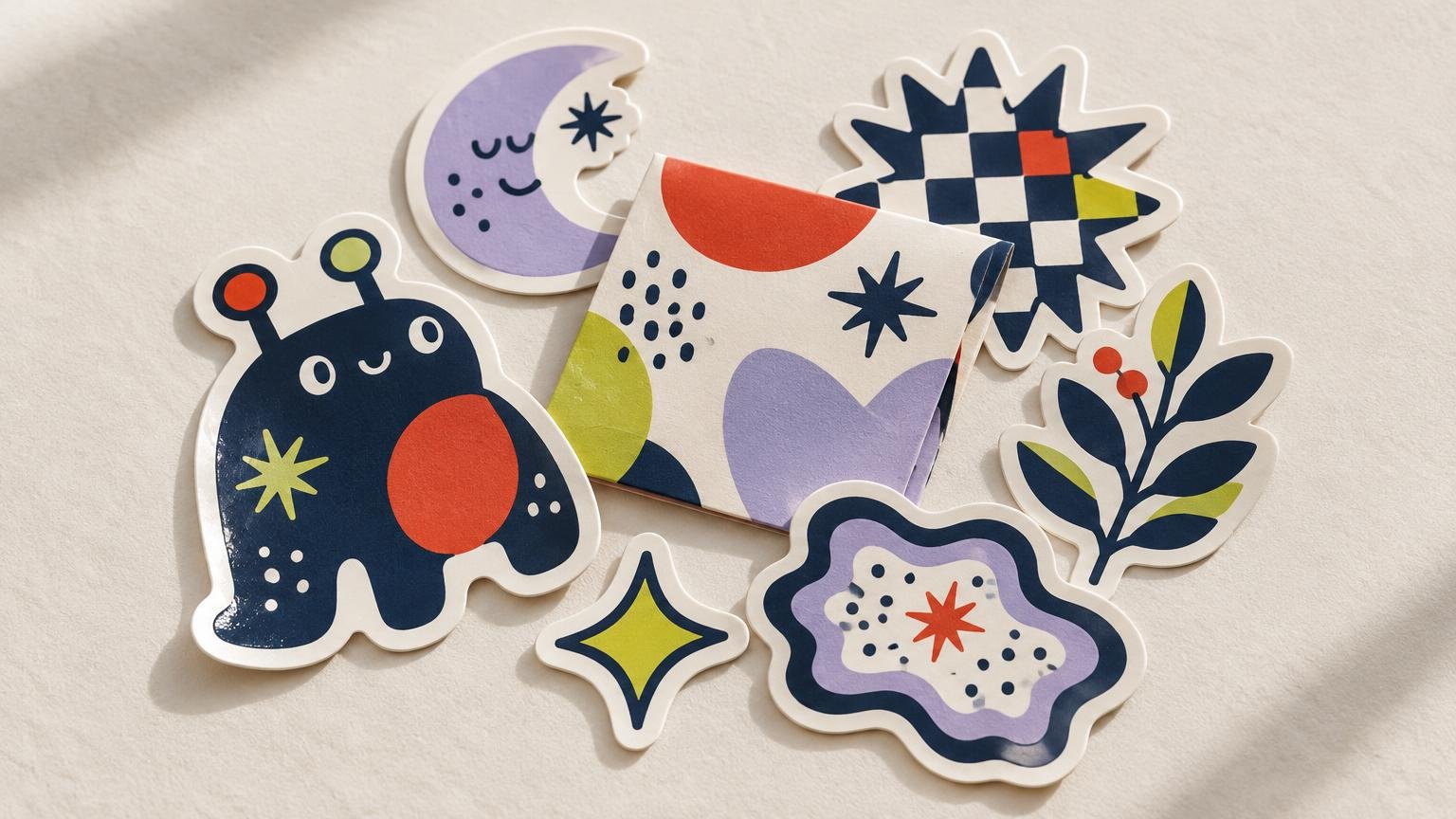
Coordination comes from repeated decisions. Pick three or four rules that will appear across the pack, such as a shared palette, consistent line weight, similar border treatment, recurring texture, or one family of lettering. Repeating every possible trait usually makes the pack stiff. Repeating none of them makes it look accidental.
Color is an efficient unifier. Choose one dominant color family, one supporting neutral, and one accent that appears selectively. The accent can identify focal details—a spark, eye, label, or tiny star—without flooding every design. Illustrator users can create swatch groups and preserve linked color relationships while adjusting a palette with the tools described in Adobe’s Recolor Artwork guidance.
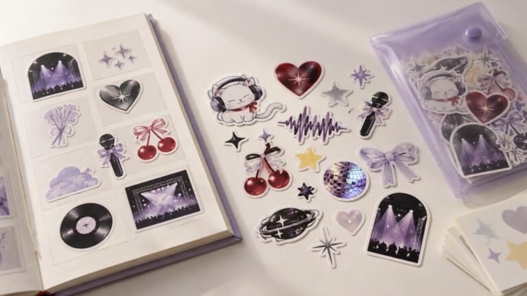
Silhouette is equally important. A pack made entirely from similarly sized circles may look tidy in a preview but lifeless in the hand. Mix tall, wide, compact, and irregular shapes while repeating a related curve language or border. Think cousins, not clones.
| Pack element | What can stay consistent | Where to introduce variation |
|---|---|---|
| Color | Core palette and accent logic | Dominant color on each sticker |
| Line | Weight, texture, and corner character | Density and amount of interior detail |
| Shape | Related curves or border treatment | Tall, wide, compact, and irregular silhouettes |
| Typography | Typeface family or lettering method | Word length, scale, and placement |
| Texture | Shared grain, halftone, or ink quality | Intensity and coverage |
Give every sticker a role
A coordinated set benefits from visual hierarchy. Design one anchor sticker that carries the clearest version of the concept. Add two or three supporting pieces that develop its world. Finish with smaller accents, symbols, or short phrases that create rhythm when the pack is displayed together.
A five-piece set, for example, might contain one large character, two medium scenes or objects, one typographic piece, and one small emblem. The format is flexible; the point is to avoid five designs competing for the same kind of attention.
Judge every piece both alone and beside its neighbors. A quiet supporting sticker may feel underwhelming in isolation but provide exactly the pause a busy pack needs. Conversely, a detailed illustration that looks impressive on a monitor can become visual porridge after reduction. The guide to how sticker scale changes illustration offers a deeper look at that shift.
Test the pack at actual size
Place all designs on one page at their intended physical dimensions. View them together, then print a basic paper mock-up if possible. This exposes weak focal points, fragile lines, crowded lettering, and false size equivalence.
Nominal dimensions can also be misleading when silhouettes differ. A long horizontal design and a near-square design may share the same longest measurement while occupying very different visual areas. Compare perceived mass, not just the number in the size field.
- Reduce every design to its intended sticker size.
- Check whether the main subject reads before the interior details.
- Compare the visual weight of neighboring pieces.
- Remove details that merge into noise rather than adding character.
- Arrange the complete set in at least two configurations to test its rhythm.
Prepare the artwork as a collection
Keep each sticker on its own clearly named artboard while maintaining one master document for the pack. This makes it easier to compare the set and export separate files consistently. Illustrator can batch-export selected artboards in multiple formats and scales, which is useful when the pack contains several individual designs.
Borders and cut shapes belong to the composition. A thick white border can calm a dense set, while a colored or borderless edge may make the pack feel more immersive. If artwork reaches the edge, extend it beyond the intended trim and confirm the printer’s bleed requirements; Adobe notes that bleed helps prevent unwanted gaps but that specifications should be checked with the printer.
Once the art system is settled, readers moving from collection design into production can review options for custom sticker printing, materials, and artwork preparation. Request a proof and inspect the set as a group rather than approving each file in a vacuum. Color, borders, and scale should still feel related after the artwork leaves the screen.
Make the presentation continue the idea
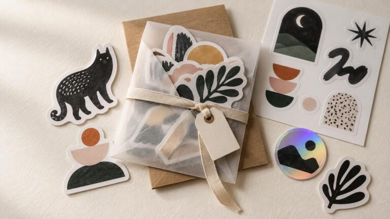
Presentation can turn several loose stickers into an unmistakable collection. A backing card, small envelope, belly band, or folded insert can repeat the pack’s palette and title without overpowering the artwork. Give the anchor sticker enough visibility and avoid arranging every piece in a rigid row unless that formality suits the concept.
Include the artist name or handle in a readable place on the presentation rather than forcing it into every illustration. If the pack is intended as a gift, the balance of theme, format, and wrapping matters as much as the raw sticker count; the guide to presenting sticker packs as gifts explores that side of the decision.
Check the rights behind every image
Original visual artwork, including artwork used for stickers and decals, can receive copyright protection once fixed in a tangible or digital form. Copyright owners generally control copying, adaptation, distribution, and public display, subject to applicable exceptions. The practical rule is simple: use your own artwork, properly licensed material, or work you have clear permission to include. A coordinated theme does not turn borrowed characters, logos, or illustrations into a safe commercial collection.
For a fuller overview, consult the U.S. Copyright Office guidance for visual artists. Names and short phrases raise different questions from illustrations, and branding may involve trademark law depending on how a mark is used and which goods or services it identifies.
Edit until the pack feels inevitable
Lay out the final set and remove the weakest piece, even if you spent hours drawing it. If the pack improves immediately, leave it out. A coordinated collection is defined as much by exclusion as inclusion.
The finished pack should reveal its premise at a glance, reward a closer look, and give each sticker a reason to exist. Repeat enough to establish identity, vary enough to create rhythm, and make every production choice serve the art. That is the difference between a bundle and a collection.