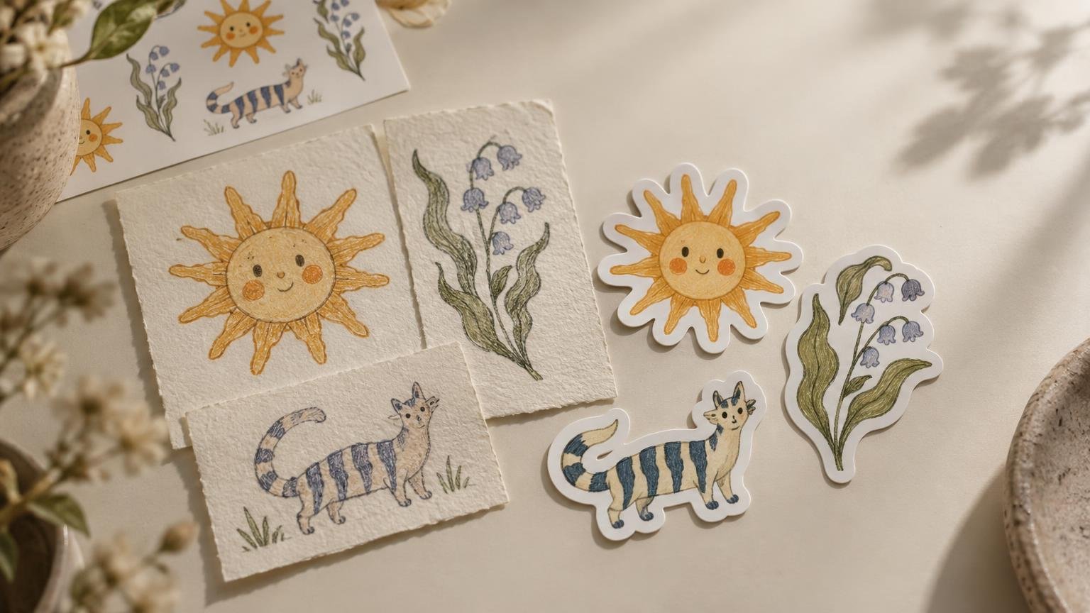
From Hand-Drawn Art to Stickers: A Small-Format Guide
TLDR: Moving hand drawn art to stickers is not a matter of shrinking every mark until it fits. Preserve the drawing’s most recognizable qualities—its line rhythm, silhouette, expression, texture and recurring motifs—while simplifying details that become noise at a small size. A successful series should feel like one artist’s world, whether it appears as separate die-cuts, a sticker sheet or a themed pack.
A sticker is not simply a miniature poster. It is seen quickly, handled closely and often placed among other graphics. That makes the transition from hand drawn art to stickers an exercise in deciding what the drawing cannot afford to lose. The goal is not immaculate smoothness. It is clarity without sanding away the human character that made the illustration interesting.
For collectors, these decisions explain why some artist stickers remain distinctive in a crowded sketchbook or display while others dissolve into generic decoration. For illustrators, they provide a way to edit a drawing without replacing its visual voice with a sterile digital imitation.
What hand-drawn art carries into sticker form
Hand-drawn work can be made with pencil, ink, marker, paint or a digital drawing tool. The medium matters less than the visible decisions made by the artist. A pressure-sensitive line, an imperfect oval, a dry-brush edge or deliberately uneven lettering can all establish identity. Digitally drawn work can be just as artist-led as work originating on paper; “hand-drawn” describes an approach, not a hierarchy of authenticity.
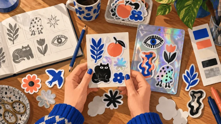
Start by identifying the drawing’s visual anchor. In character art, it might be a facial expression, posture or oddly proportioned accessory. In lettering, it could be the relationship between heavy downstrokes and loose surrounding marks. In a botanical drawing, the memorable element may be a crooked contour rather than every vein on every leaf.
A useful test is to describe the image without naming its subject. Is it scratchy and nervous? Rounded and sleepy? Dense, angular and confrontational? If that description stops being true after the art is reduced, the edit has probably removed too much of its personality.
What changes when hand drawn art becomes a sticker
Sticker scale changes the hierarchy inside an illustration. Fine marks that support a larger drawing may compete with its focal point after reduction. Two nearby lines can visually merge. Subtle midtones can become one muddy patch. Small lettering may technically remain present while becoming functionally unreadable.
The solution is selective emphasis, not blanket simplification. Keep the marks that explain form or carry personality. Reduce repeated hatching that no longer separates one area from another. Open space around important features, and strengthen a few contours rather than making every line equally heavy. For a deeper look at this shift, see how sticker scale changes illustration decisions.
Judge the silhouette before the surface detail
Temporarily view the drawing as a single dark shape. Can you still identify its direction, posture or basic subject? A strong silhouette gives the interior marks somewhere to live. A weak one forces texture and color to do all the explanatory work.
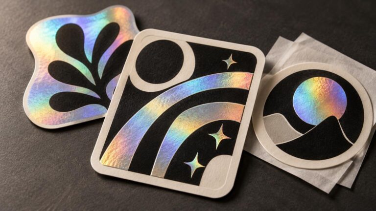
This matters especially for a die-cut sticker, where the outer contour becomes part of the composition. Wispy hair, thin antennae and narrow protrusions may look expressive in a sketch but create a fussy edge when isolated. They do not always need to disappear. Sometimes they can be grouped into a larger shape or surrounded by a border that preserves their gesture.
Protect useful negative space
Empty areas are not wasted sticker real estate. They separate a character’s arm from its body, keep lettering from colliding with an illustration and allow a textured patch to remain legible. When every gap is filled, a small drawing can become a knot of equally urgent information.
Look at the artwork at roughly its intended physical scale instead of judging only a magnified screen view. Then look away and return to it. The first element noticed should be the intended focal point. If the eye lands on an accidental tangle of crosshatching or a decorative border, the hierarchy needs another pass. These small-scale sticker design cues are also useful when evaluating finished art as a collector.
Keep texture, but give it a job
Texture can communicate fur, grit, shadow, age or nervous energy. It becomes a problem when it covers every region with the same intensity. Consider concentrating pencil grain or marker streaks in selected areas while leaving quieter shapes nearby. Contrast between worked and unworked surfaces often preserves more of the original hand than indiscriminately retaining every scan artifact.
Black-and-white drawings make this especially obvious because contour, fill and texture must establish the hierarchy without help from hue. The same principle applies to color: one dominant value and a few deliberate accents usually read more clearly than a field of nearly identical midtones. The guide to contrast in black-and-white sticker art explores that visual problem in more detail.
Turn separate drawings into one artist-led series
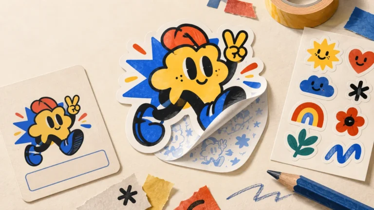
A coherent sticker series does not require five versions of the same pose. It needs a repeatable visual logic. That logic might come from line weight, a restricted palette, recurring symbols, shared border treatment, a family of characters or a consistent balance between dense texture and open space.
Variation should occur inside that system. One design can be tall and narrow while another is compact and circular. A close-up face can sit beside a full-body character. Lettering can interrupt the sequence. The pack remains connected because the drawings share a visual grammar, not because they are duplicates wearing different hats.
- Choose one or two recurring anchors, such as a line style and limited palette.
- Vary scale and composition so the series has rhythm when viewed together.
- Repeat motifs selectively; repetition should build recognition rather than fill space.
- Give each design a reason to exist alone, even if it belongs to a larger story.
- Remove the weakest near-duplicate instead of using it to inflate the pack.
Collectors can apply the same framework when judging a group of stickers. A worthwhile pack should reveal more of an artist’s visual world as the pieces are compared. It should not feel like unrelated leftovers bundled together. See the broader guide to what makes a sticker pack feel curated for additional collecting criteria.
Sticker sheet, die-cuts or themed pack?
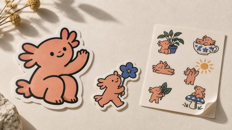
Format changes how a viewer encounters the drawings. A sticker sheet presents the series as one composition before any piece is removed. It suits small related elements, visual sequences and sets whose spacing contributes to the mood. Tiny expressions, icons and accessories can make sense together even when they would feel slight as separate objects.
Individual die-cuts give each illustration a stronger identity. They work well when every drawing has a clear outer contour and enough visual weight to stand alone. A themed pack offers the widest range: it can combine a central character, smaller symbols, lettering and alternate shapes while retaining a shared visual language.
| Format | Strongest creative use | Watch for |
|---|---|---|
| Sticker sheet | Small related drawings, sequences and miniature visual worlds | Crowded spacing or pieces that become unclear when separated |
| Individual die-cuts | Bold silhouettes and designs intended to stand alone | Fragile protrusions and overly complicated outer contours |
| Themed pack | A varied series connected by palette, motifs or characters | Near-duplicates and unrelated filler |
Choose the format after identifying how the drawings relate. Do not force an intimate sheet of tiny visual jokes into a set of oversized separate pieces, or compress bold standalone characters into a crowded page merely because a sheet appears efficient.
A collector’s checklist for hand-drawn sticker art
The best way to collect illustration stickers is to follow the artist rather than chase an isolated surface style. A single appealing design may lead to a larger body of drawings, recurring characters, zines or later series. That context makes the sticker more than a detachable image.
- Can you identify the artist from the listing, packaging or accompanying information?
- Does the sticker retain a distinct line, texture or compositional habit?
- Do multiple designs relate without repeating the same image mechanically?
- Does the artwork remain readable at its actual size rather than only in an enlarged preview?
- Can you find an artist-controlled portfolio, shop or account that confirms the attribution?
- Are you collecting a visual point of view, or merely accumulating familiar motifs?
When building a collection, group work by artist or visual language before sorting solely by size or color. That approach makes recurring decisions easier to see: the same crooked lettering appearing across several subjects, a character’s changing expressions, or the way an artist repeatedly handles borders and empty space. Readers starting from a box of miscellaneous designs can use this guide to collect artist stickers more intentionally.
Credit, permission and original artwork
Artist identification is both a collecting aid and a rights issue. The U.S. Copyright Office explains that original visual art can receive copyright protection once it is fixed in a tangible medium and that the author is generally the initial owner, subject to exceptions such as qualifying works made for hire. Copyright owners control rights that include copying, adapting, distributing and publicly displaying protected work, within the limits of copyright law.
In practical terms, finding an image online does not make it available for conversion into stickers. Do not reproduce or adapt another person’s drawing without permission from the relevant rights holder. If ownership or the permitted use is unclear, pause the project rather than treating absent credit as consent. The U.S. Copyright Office’s guidance for visual artists provides a useful starting point for understanding these rights. This is general information, not legal advice.
Make the print step serve the drawing
Once the visual edits are settled, the production question becomes narrower: can the chosen format preserve the intended contour, contrast and texture? Keep an untouched version of the original drawing, compare the reduced design at physical size and order a proof or small test when the process allows. Artists ready to move from resolved illustration into a physical edition can explore custom sticker printing without turning production options into the creative brief.
The final check is simple: place the reduced design beside the original and ask whether they feel like the same voice. The sticker may contain fewer marks, a clearer contour and more open space, but it should retain the drawing’s attitude. That is the real task when moving hand drawn art to stickers—not preserving every line, but preserving the reason someone would want to keep looking.