How to Create Original Themed Stickers Without Copying Existing Artwork
TLDR: The answer to how to create original themed stickers without copying existing artwork is to build from a broad subject, not somebody else’s finished illustration. Define your own setting, shapes, proportions, palette, line treatment, humor, and pack structure. Use varied references, thumbnail the whole set, and review the designs for distinctive borrowed elements before posting or printing them.
Two artists can both draw space cats, grumpy mushrooms, haunted snacks, or retro camping gear. The subject is not what makes one design a copy. Trouble begins when the second design repeats the first artist’s particular character proportions, pose, expression, composition, color relationships, lettering, or other recognizable choices. Originality comes from making enough connected decisions that the finished visual world belongs to you.
A theme is a starting point, not an illustration
Copyright in the United States protects original expression rather than ideas, concepts, methods, or systems. That distinction leaves room for many artists to work with the same broad theme while protecting the particular artwork each one creates. A concept such as “garden insects running a tiny café” is still open-ended. A finished drawing of a bow-tied beetle holding a striped cup in a distinctive pose and composition is specific visual expression.
Before opening a reference board, reduce the project to a plain-language theme sentence. It should describe the world you want to create without pointing toward an existing franchise, character, or artist.
For example: “A six-piece sticker pack about nocturnal garden creatures operating a roadside diner, drawn with chunky ink shapes, a muted night palette, and one bright accent on every design.” That sentence provides direction while leaving hundreds of visual questions for you to answer.
- Subject: What people, creatures, objects, or places belong in this world?
- Mood: Is it cozy, tense, deadpan, chaotic, elegant, or gloomy?
- Setting: Where do the subjects exist, and what environmental details recur?
- Mark-making: Will the art use crisp geometry, scratchy lines, flat shapes, collage, or another treatment you can develop yourself?
- Pack rule: What constraint connects the pieces, such as one repeated accent color or a shared border shape?
Build a reference system instead of copying one source
A mood board becomes risky and creatively limiting when most of it comes from one artist. Even without tracing, repeated exposure to the same work can pull your poses, silhouettes, facial construction, and palette toward that artist’s solutions.
Build separate reference groups for separate questions. Use your own photographs or direct observation for anatomy and objects. Look at historical clothing, architecture, natural textures, packaging structures, maps, or public signage for context. Collect color references from places outside sticker art. Study several unrelated compositions to understand visual balance rather than adopting one layout wholesale.
- Subject references: real animals, plants, food, tools, vehicles, or places
- Structural references: poses, joints, mechanisms, clothing construction, or object geometry
- Atmosphere references: lighting, weather, surface texture, and environmental color
- Format references: silhouettes, badge structures, borders, and arrangements from varied sources
- Personal material: your photographs, observational drawings, handwriting, pattern studies, and unused sketchbook ideas
Label what each reference is helping you solve. “Moth wing structure” is a useful note. “Make mine look like this” is a warning. If removing one artist from the board makes the entire project collapse, the concept needs another round of development.
Turn the theme into your own visual language
Style is not a filter applied at the end. It is the accumulated result of decisions about shape, proportion, line, color, space, and emphasis. Make those decisions consciously rather than borrowing a recognizable package of traits from somebody else.
Start with silhouette and proportion
Draw each subject as a solid black shape. Can you distinguish the moth server from the slug cook without interior detail? Push your own proportion system: perhaps heads are narrow, bodies are low and wide, and props are comically oversized. A readable silhouette also helps the image survive at sticker scale. The site’s guide to spotting strong sticker art at a small size explores this practical side of the design.
Choose a palette by function
Instead of lifting the exact colors from an admired illustration, decide what each color must do. A dark base might establish the nighttime setting, a pale neutral might separate faces from backgrounds, and one acidic accent might mark food or signage. Test alternative hues within those roles. Functional palette planning produces coherence without making another artwork your color chart.
Give the pack its own rhythm
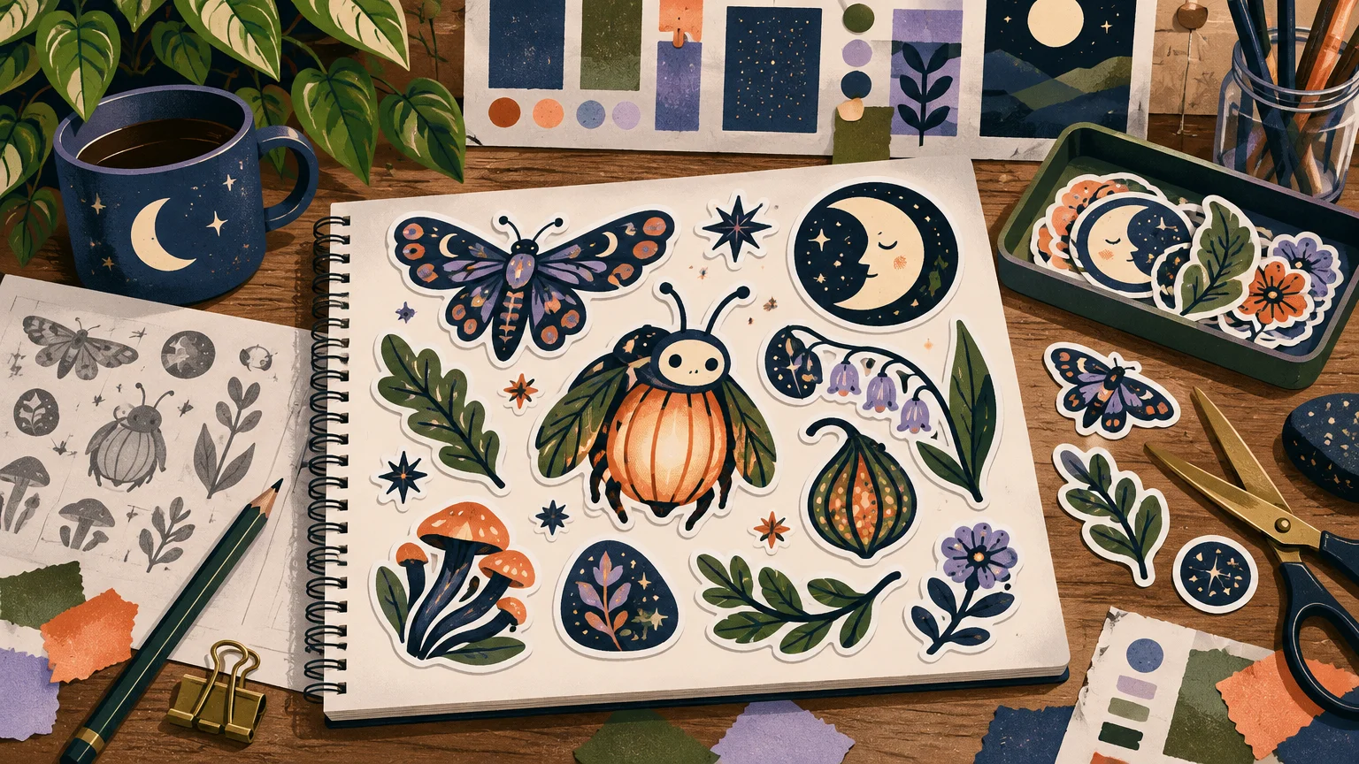
A cohesive set does not require six nearly identical compositions. Create one large anchor design, two or three character or object designs, and smaller supporting pieces such as symbols, props, or short original phrases. Vary the visual density and outer shape while preserving your chosen world and drawing language. For a deeper look at sequencing and variety, see how to build a designer sticker pack people want.
Thumbnail the full pack before polishing anything
Polishing the first idea too early can trap the rest of the pack in its orbit. Make several tiny thumbnails for every sticker, then place all the candidates on one page. At this scale, you can judge silhouette, repetition, visual weight, and whether one piece appears to belong to a different project.
Suppose the theme is “melancholy household ghosts.” Generate multiple roles rather than drawing one popular ghost archetype with different accessories: a ghost hiding in folded laundry, one stretching between curtain panels, one fogging a bathroom mirror, and a tiny supporting sticker made from spectral dust and lost buttons. The setting creates the jokes and poses. You are designing relationships inside a world, not dressing up a borrowed mascot.
A useful pack test is to remove the shared palette temporarily. If the pieces still relate through line, proportion, mood, and narrative, the concept has structural coherence. If color is doing all the work, develop the drawing language further. What makes a sticker pack feel curated offers additional criteria for evaluating the set as one object.
Run a “too close” review
Set the work aside briefly, then compare it with your references at thumbnail size and full size. This is a creative screening process, not legal clearance. Look beyond whether you traced anything. A design can remain uncomfortably close because it preserves the unusual collection of choices that makes another work recognizable.
- Does the design repeat an unusual pose, camera angle, expression, or arrangement?
- Are the anatomy, facial features, costume, props, and proportions recognizable as another artist’s character construction?
- Did you preserve a distinctive color relationship, even if you changed individual hues?
- Are you using a catchphrase, fictional name, logo, costume, emblem, or branded packaging cue?
- Would viewers identify the other artist, franchise, or brand before they identify your theme?
- Did you make only surface edits, such as changing colors, reversing the pose, or adding an accessory?
- Can you explain the design through your own theme sentence and references without naming the work that inspired it?
If the design is too close, revise from the concept level. Changing the hat on a borrowed character construction rarely fixes the underlying problem. Return to silhouette, role, setting, action, and composition. Replace several connected decisions rather than adding decorative differences.
Know when originality is not the only issue
In U.S. copyright law, a derivative work includes a recast, transformed, or adapted version of a preexisting work. Minor changes should not be treated as an automatic route to permission. Credit, a “fan art” label, a small print run, or a claim that the design is unofficial does not by itself settle whether you may reproduce or adapt protected art.
The U.S. Copyright Office explains that independently created visual and graphic works can receive protection when they contain sufficient creativity, and protection begins when the work is fixed in a form such as a drawing or digital file. Its copyright guidance for visual artists also discusses permissions and recommends obtaining authorization when you want to use another person’s protected visual work in a way controlled by the copyright owner.
Names, logos, symbols, and commercial presentation can raise trademark questions as well. The USPTO explains that trademarks may include words, phrases, symbols, designs, or combinations that identify the source of goods or services. Similarity in appearance, sound, meaning, or overall commercial impression can matter when assessing possible confusion.
Be especially cautious with designs based on movies, games, celebrities, sports identities, branded products, logos, and recognizable characters. If another creator’s protected work or brand identity is essential to the design, seek appropriate permission or a license. For a commercially important release with unresolved similarities, consult a qualified intellectual-property lawyer. These are U.S.-focused creative guardrails, not individualized legal advice, and rules differ by jurisdiction.
Keep an authorship folder
Save the material showing how the pack developed. Documentation does not repair copying, but it can preserve a clear record of your independent process and make future revisions, collaborations, or licensing discussions easier.
- Dated theme notes and thumbnail sheets
- Your original reference photographs and observational sketches
- Versions showing changes to silhouettes, poses, and compositions
- Layered working files and exported milestones
- Receipts and license terms for any permitted third-party assets
- Written collaborator agreements covering authorship, payment, and permitted uses
- Records of any permission received from artists or rights holders
U.S. creators interested in formally registering their work can review the Copyright Office’s official visual-arts registration guidance. Registration is a separate administrative question from whether the design process was genuinely original.
Move to production only after the concept is settled
Once the artwork has a distinct visual language, review it at its intended physical size. Simplify details that merge, strengthen weak silhouettes, check that borders do not crowd the image, and make sure every piece earns its place in the pack. The creative workflow should come before printer decisions.
When the original files are ready, turning artwork into a small-run vinyl sticker pack covers the transition from a coherent set to production preparation. Artists ready to compare an actual printing destination can also explore custom sticker printing options after confirming file requirements directly with the provider.
Make the theme recognizable through your decisions
A strong themed pack does not need borrowed characters or a near-copy of a fashionable artist’s style. Write a specific theme sentence, gather references by function, invent a proportion and shape system, thumbnail the complete set, and challenge anything that feels recognizably borrowed. The goal is not merely to make each sticker different from its references. It is to make the collection feel unmistakably connected to the visual world you built.
References
- What Does Copyright Protect? (FAQ) | U.S. Copyright Office
- Chapter 1 – Circular 92 | U.S. Copyright Office
- What Visual and Graphic Artists Should Know about Copyright | U.S. Copyright Office
- What is a trademark? | USPTO
- Likelihood of confusion | USPTO
- Visual Arts: Registration | U.S. Copyright Office