Holographic Stickers: Design, Artwork, and Buying Guide
TLDR: Treat holographic material as part of the illustration, not as sparkle added after the design is finished. Use opaque white backing where colors, text, faces, or linework need to remain stable; expose the reflective base where movement and rainbow shifts have a clear visual job. Review the art at its final physical size, request a proof, and order a small test quantity before building an entire release around the effect.
This holographic stickers design and buying guide is for artists who want shimmer without surrendering the composition. The central question is not simply whether holographic vinyl looks interesting. It is whether the changing reflection strengthens the focal point, separates layers, or contributes to the subject of the artwork.
A holographic sticker is most convincing when the effect belongs to the idea: light flashing across a robot visor, an aura behind a character, foil-like lettering, water, magic, chrome, stars, or a deliberately loud background. If every surface competes for attention, the sticker may have plenty of spectacle but very little hierarchy.
What holographic material changes
Artwork created against a white digital canvas does not automatically behave the same way on reflective stock. CustomStickers describes its holographic material as having a reflective silver base. It also warns that pale colors can look muted, dark colors can reduce the visible rainbow effect, and exact color matching is not guaranteed on this material. Those characteristics make holographic vinyl a compositional variable rather than a neutral substitute for white vinyl.
Reflection also changes with illumination and viewing angle. That movement is the attraction, but it means a static screen preview cannot communicate every appearance the finished sticker may take. A seller can describe a piece honestly as shifting with light and angle instead of promising that it will always resemble one carefully staged photograph.
Before committing to the effect, decide which information must stay visually stable. A character’s expression, a small title, a signature mark, or the dark contour separating two forms may deserve more protection than a halo, background field, or broad decorative shape.
Use a mask, reveal, or mixed treatment
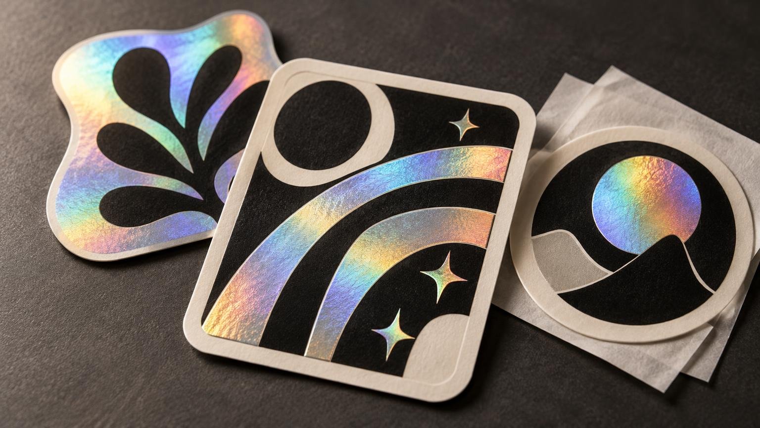
A practical way to plan holographic artwork is to divide it into stable areas and reveal areas. The printer may implement these areas through white ink or white backing beneath selected parts of the image. Terminology and file setup vary, so confirm the provider’s workflow rather than assuming that a transparency layer will be interpreted automatically.
| Treatment | Visual role | Good candidates | Main risk |
|---|---|---|---|
| Opaque or white-backed | Keeps printed areas more stable and opaque | Faces, fine linework, text, logos, focal objects | Too much coverage can hide most of the holographic effect |
| Exposed holographic base | Makes the silver and rainbow shift prominent | Halos, skies, magic effects, chrome, water, broad negative space | Important detail can lose contrast as the reflection changes |
| Mixed treatment | Assigns the effect to selected parts of the composition | Character stickers, emblems, typographic pieces, variant editions | An unclear mask can make the result look accidental |
StickerGiant distinguishes among opaque white backing for more stable opaque color, transparent areas that reveal a stronger silver or rainbow effect, and reduced white backing that allows a colored holographic appearance. Its holographic artwork setup guide also recommends white backing for detailed linework, small text, and logos.
Think of that backing as a lighting decision. A fully backed character over an exposed halo can remain readable while the surrounding shape moves. A white-backed wordmark over a reflective field can preserve the letterforms. Conversely, leaving tiny lettering transparent may force the reader to chase the right viewing angle just to decipher it.
Choose artwork that gives the shine a job
Holographic stock often suits designs with a decisive silhouette, broad graphic regions, clear value separation, and enough negative space for the reflective pattern to register. Large typography can work when its edges remain clear. Effects-led subjects—cosmic scenes, cybernetic details, magical energy, metallic objects, or surreal light—offer obvious places for the shifting surface to participate.
These are creative possibilities, not laws. A delicate drawing can use a narrow holographic accent beautifully, while a bold illustration can still become unreadable if every dark region suppresses the effect. The wider guide to matching sticker materials with different kinds of art can help if holographic vinyl is only one of several finishes under consideration.
Designs that deserve extra caution
Pale lettering, delicate gradients, crowded low-contrast scenes, and color-critical brand work require more scrutiny. The concern is not that these elements are forbidden. It is that reflective silver beneath printed color can alter their apparent weight or character, while intense dark coverage may leave little visible holographic movement.
QR codes are a particularly unforgiving case because reliable scanning matters more than decorative shimmer. StickerGiant recommends placing a solid white field behind and around a QR code on holographic stock. Even then, test the physical sample with several ordinary phones and lighting conditions before using it in a release.
Preserve hierarchy at the finished sticker size
The reflective effect cannot rescue an illustration that loses its focal point when reduced. Decide what should be recognized first, what supports it, and what can disappear without damaging the idea. Designer Stickers’ guide to spotting strong art at a small sticker size expands on this way of judging hierarchy.
Inspect the design on screen at approximately its intended physical dimensions. The site’s sticker-scale guidance recommends establishing focal hierarchy and reviewing artwork at actual sticker size rather than relying on tiny details that are persuasive only when enlarged. Zoom in to inspect craft, but zooming out is where the sticker has to pass its audition.
- Check whether the main silhouette is recognizable before studying the interior detail.
- Protect contrast around eyes, facial features, lettering, and other information-bearing marks.
- Remove texture that turns into visual grit when reduced.
- Give holographic reveal areas enough room to read as intentional shapes.
- Evaluate the cut contour as part of the composition, especially around narrow points and fragile projections.
- Print a paper mock-up at finished size to assess scale, even though it cannot simulate the reflective effect.
Full holographic treatment or selective reveal?
A full treatment makes sense when surface movement is the main visual proposition. It can suit a bold emblem, an effects-heavy illustration, or a design built around a large reflective field. The artwork should still retain enough structure to remain recognizable when the light is less dramatic.
Selective reveal is usually the more controlled option. It lets the effect act like an accent color: limited, repeated, and assigned to specific forms. A creature’s wings, the counterspaces inside letters, or a ring behind a portrait can flash while the main drawing stays visually anchored.
A holographic version can also function as the hero piece in a pack rather than becoming the finish for every design. Surrounding it with quieter stickers creates rhythm and gives the reflective piece a reason to feel special. For planning the complete release, see the guide to turning artwork into a small-run vinyl sticker pack.
Holographic stickers design and buying guide checklist
Once the art direction is settled, compare printers by the questions that affect the finished object. Vinyl alone does not determine the result; finish, adhesive, intended surface, and other construction choices matter too. Avoid assuming that a broad durability claim applies to every combination of material, laminate, adhesive, surface, and exposure.
- Finished dimensions: Confirm the physical size and inspect every critical element at that scale.
- Cut treatment: Decide whether each piece should be individually die-cut or supplied on a kiss-cut sheet, then ask how close the cut can safely approach the art.
- Border and bleed: Ask for the printer’s current templates and requirements rather than borrowing measurements from another provider.
- White-ink control: Find out whether you can choose white-backed, exposed, and partially backed regions—and exactly how those regions must be marked in the file.
- Finish: Confirm whether the surface is glossy, matte, laminated, or offered in another configuration, and ask how that finish changes the visible holographic effect.
- Proofing: Determine whether the proof shows cut lines and white-ink placement, and whether it is digital or physical.
- File setup: Follow that provider’s current requirements for accepted formats, color handling, resolution, margins, and transparency.
- Adhesive and surface: Tell the printer where the sticker is intended to go and ask whether the product is appropriate for that surface.
- Quantity and replacement policy: Compare a small test order with the planned production quantity and review what happens if the delivered order differs materially from the approved proof.
CustomStickers publishes its own accepted file formats, full-size resolution guidance, minimum-detail guidance, safety margins, and bleed instructions. Those are provider-specific requirements, not universal rules for every holographic printer. If its current product and workflow fit the project, artists can move from planning to ordering through a custom sticker printer, but the live specifications and commercial terms should be checked before submitting artwork.
Make the test order answer real questions
A test run is most useful when it is treated as an experiment rather than miniature inventory. Include the actual smallest text, finest important line, palest color, darkest region, sharpest cut detail, and intended holographic reveal. View the samples under soft daylight, ordinary indoor light, and less flattering conditions. The objective is not to find one glamorous angle; it is to learn whether the visual hierarchy survives normal handling.
Compare the physical sample with the approved proof and original design, then record specific changes. “Needs more contrast around the eyes” is actionable. “Needs more pop” is how revision rounds wander into the woods.
- Check whether the focal point remains obvious as the sticker tilts.
- Confirm that backed and exposed regions match the intended mask.
- Read all small text without searching for a favorable angle.
- Inspect the cut shape and border balance at arm’s length.
- Apply a sample to the intended type of clean surface and evaluate whether that use matches the printer’s guidance.
- Photograph the sample in several ordinary lighting conditions so product images represent its changing appearance.
- Revise the mask, contrast, or scale before committing to the larger pack run.
Let the material serve the illustration
The strongest reason to choose holographic stock is not that it attracts attention. It is that its movement completes a specific visual idea. Decide what must remain stable, expose only the areas that benefit from reflection, and protect hierarchy before chasing spectacle.
Start with one design and one deliberate effect. Review it at finished size, confirm the printer’s white-ink and proof workflow, and use a small test order to see what the material actually does. If the sticker still reads clearly when the rainbow flare moves away, the shimmer is supporting the art rather than doing all its work.