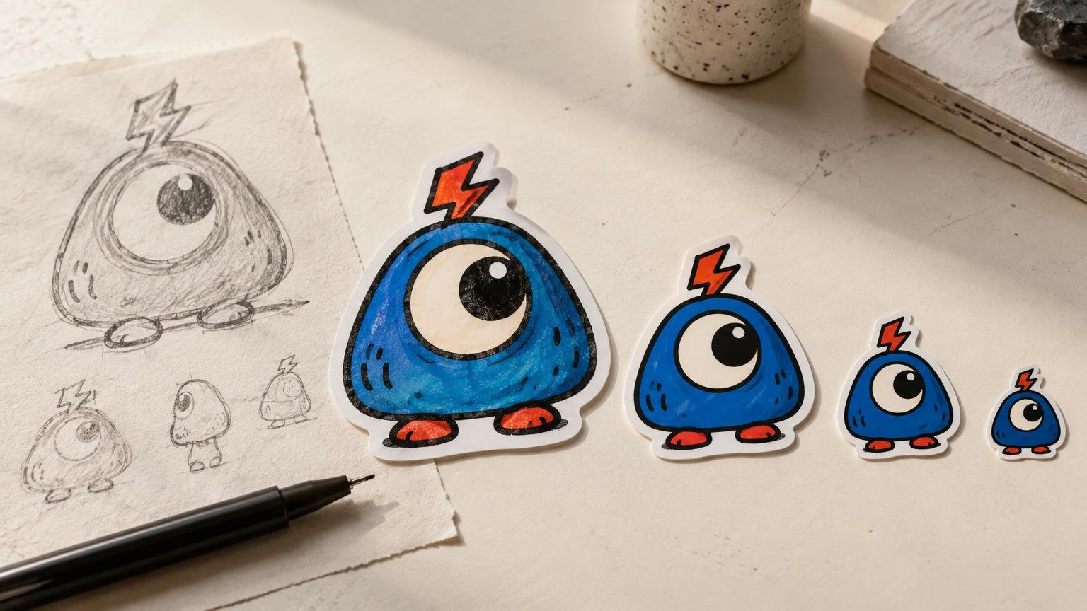
How to Draw Stickers That Read Clearly at Small Size
A sticker drawing has to make its point quickly. It may live on a sketchbook beside a dozen other pieces, appear in a collector’s binder, or become one voice in a crowded sticker pack. If its silhouette, focal point or expression disappears when the art gets small, extra detail will not rescue it.
The best approach is to design for reduction from the beginning. Build a recognizable outer shape, establish one dominant idea and add detail only where it strengthens that idea. A sticker can be intricate, but it should not require forensic examination to discover what the subject is.
Start with the sticker’s main read
Before drawing eyelashes, jacket patches or tiny texture marks, decide what someone should notice first. It might be a character’s oversized eyes, the sharp arch of a creature’s back, a chunky hand-lettered phrase or a strange object with an unmistakable outline.
Reduce the concept to a sentence: “a grumpy cloud holding a match” is more useful than “a detailed weather-themed composition.” The first gives you a subject, attitude and prop. The second leaves you arranging decoration without a visual hierarchy.
Make several tiny silhouette sketches using only dark and light shapes. Do not treat these as precious drawings. Their job is to expose weak poses, awkward tangencies and compositions that become a mysterious potato when reduced. For a deeper look at how physical dimensions alter the reading of an image, see how sticker scale changes illustration decisions.
Build a silhouette that does some of the work
A clear outer contour gives the viewer information before interior details become visible. Pointed ears, a tilted cap, a dramatic hairstyle, an asymmetrical prop or a distinctive body position can make a character identifiable from across a table.
Avoid letting every limb, accessory and tuft of hair merge into one dense perimeter. Small gaps between forms create useful negative space. If an arm crosses the body, for example, a light opening near the elbow may explain the pose more effectively than another contour line.
Die-cut thinking can help even before production enters the conversation. Ask whether the outer shape feels deliberate. A complicated contour with twenty tiny bumps may look energetic on screen but fussy as an object. Simplifying three minor protrusions into one confident curve often gives the artwork more presence.
Control line weight and contrast
Lines that look elegant at full drawing size can become faint, broken or visually tangled after reduction. Use stronger lines for the primary contour and thinner lines for secondary information. The goal is not to outline everything heavily; it is to establish an order of importance.
Contrast needs hierarchy too. One dark focal area surrounded by quieter values is usually easier to read than a drawing filled edge to edge with equally loud patterns. Squint at the image or view it as a tiny thumbnail. If the face, word or central gesture vanishes, adjust the value structure before polishing the details.
Color is optional, not a repair tool. Strong black-and-white artwork can rely on contour, solid fills, hatching and open space rather than a large palette. The examples and visual principles in our guide to black-and-white sticker art are useful if you want contrast to carry the design.
Give small details a job
Detail should establish character, texture or rhythm. A few uneven teeth may define a creature’s expression. Repeated stars can connect several pieces in a pack. A carefully placed scratch pattern can make a robot feel battered. Fifty tiny scratches everywhere mostly make visual soup.
Separate essential details from optional ones. Preserve the features that explain the subject or mood, enlarge details that matter, and remove marks that merely prove how long the drawing took. Small-format art rewards editing, which can feel cruel until the character suddenly becomes much clearer.
- Keep the focal feature larger and cleaner than surrounding decoration.
- Use clusters of texture rather than distributing texture uniformly.
- Leave quiet areas around a face, symbol or short phrase.
- Check that interior gaps remain visibly separate when the art is reduced.
- Remove details that compete with the expression or central gesture.
Treat borders as part of the composition
An offset border can separate artwork from a busy surface and turn an irregular illustration into a more unified object. Adobe’s sticker-design tutorial demonstrates one method: creating a larger offset shape and placing it behind the artwork. That is a useful construction, not a rule that every sticker needs a white halo.
A border should reinforce the drawing rather than squeeze it. Allow more breathing room near sharp corners, loose hair and small projections. You can also skip the conventional border when a rectangular background, transparent area or edge-to-edge composition is integral to the piece. Judge it as a visual decision, not a compulsory sticker effect.
Make lettering readable, not merely present
If the sticker contains words, draw the lettering as a major shape. Short phrases, open counters and distinct letterforms survive reduction better than cramped sentences. Watch letters such as e, a, R and B: their interior spaces are often the first parts to clog visually.
Test the phrase without the illustration and the illustration without the phrase. Each should still have a clear role. If the lettering is essential but becomes subordinate to decorative flourishes, simplify those flourishes or increase the type’s visual weight.
Test the drawing as an object and as part of a pack
View the art at its intended physical size rather than trusting a generous zoomed-in canvas. Print a rough paper version if possible, cut around the approximate contour and place it beside other stickers. This exposes weak edges, muddy details and an accidental resemblance to every other rounded character sticker currently roaming the planet.
For a series, line up all the designs and compare their visual weight. Cohesion can come from repeated line treatment, border width, palette, character proportions or motifs. It does not require five versions of the same pose. The broader guide to sticker art styles can help you identify which visual language the set is actually using.
Sticker art also has a life beyond the original drawing. A study of sticker artists in St. Petersburg describes pieces being exchanged, given away, collected, documented online and combined with neighboring stickers in public settings. Its observations are specific to that scene, but they offer a useful reminder: your drawing may eventually be encountered beside work you did not choose. Read the City & Community study on sticker artists and circulation.
Draw from references without copying someone else’s work
References can help with anatomy, objects, lettering structures and composition, but they should inform an original result. Avoid tracing another artist’s sticker, lifting a character or copying a logo and assuming that changing the colors makes it yours.
The U.S. Copyright Office’s guide for visual artists explains that original drawings and digital art receive copyright protection once fixed in a tangible medium. Copyright owners generally control copying, distribution, adaptation and public display, although legal exceptions can apply. Logos and brand identifiers may also raise trademark questions.
For a safer creative process, gather several references, identify the general qualities you want and close them before developing the final composition. “Compact pose, three-color palette and nervous expression” is a direction. “That artist’s character with different shoes” is not much of one.
Use a reduction-first drawing workflow
- Write the concept as one clear subject, action or phrase.
- Sketch several tiny silhouettes before choosing a composition.
- Establish the focal point with value and scale.
- Add interior lines in a clear hierarchy.
- Introduce only details that support character, texture or rhythm.
- Test the art at its intended size and remove visual clutter.
- Compare it with the rest of the pack or collection.
- Choose the border and final contour after the drawing reads clearly.
Once the artwork is resolved and you want to turn it into a physical piece, customstickers.com offers custom sticker printing and artwork-preparation options. Production is the final step, though; it cannot replace the decisions that make the drawing readable.
The strongest sticker drawings are not necessarily the simplest or the loudest. They are the ones that preserve their identity after reduction. Start with the silhouette, protect the focal point and make every small mark justify the space it occupies. If the design still has attitude when it fits in the palm of a hand, it is ready to become a sticker.
Frequently Asked Questions
What should I draw first when designing a sticker?
Start with several tiny silhouette sketches. Choose the composition whose subject, pose and attitude remain recognizable without interior details.
How can I tell whether a sticker silhouette works?
Fill the design as one dark shape and view it as a small thumbnail. If important forms merge into a mysterious potato, simplify the contour or introduce clearer negative space.
Should every line in a sticker drawing be thick?
No. Use stronger lines for the main contour and thinner lines for secondary information. The difference creates hierarchy without burying the artwork under one heavy outline.
How much detail should a small sticker include?
Keep details that explain character, texture or rhythm. Enlarge essential features, cluster decorative marks and remove anything competing with the focal point.
Does every sticker need a white border?
No. An offset border can separate artwork from a busy surface, but it is a construction choice rather than a universal rule. Adobe demonstrates the technique by placing an enlarged offset shape behind the artwork.
How do I make sticker lettering readable?
Treat the words as a major shape. Favor short phrases, distinct letterforms and open interior spaces, then reduce the design to check whether counters in letters such as e, a, R and B remain clear.
How can individual stickers feel cohesive as a pack?
Repeat selected features such as line treatment, border width, palette, proportions or motifs. Cohesion does not require recycling the same pose across every design.
Can I use another artist’s sticker as a drawing reference?
Use references to study general qualities, but do not trace protected artwork, lift characters or treat a color change as originality. The U.S. Copyright Office says original drawings and digital art are protected once fixed in a tangible medium, subject to applicable legal exceptions.
What is the best final test before producing a sticker?
View or print the art at its intended physical size, cut around the approximate contour and place it beside other stickers. Rework weak edges, clogged details or a focal point that disappears.